12 Paint Colors for Small Living Rooms That Feel Genuinely Life-Changing
I have a bone to pick with the “all-white” rule for tiny apartments. We’ve all been told that if a room is small, you have to paint it hospital white to make it feel “airy.” But honestly? In a room with limited natural light, white paint often just turns a dingy, depressing gray in the corners. It’s a total myth that color shrinks a room. In fact, playing it too safe is usually the biggest mistake you can make. I was not prepared for how good this looks when you actually lean into depth and tone instead of fighting the square footage.
If you’re currently staring at four white walls and feeling like your space has zero personality, it’s time for a change. Choosing the right shade can blur the boundaries of your room and make the walls feel like they’re receding rather than closing in. Before we get into the swatches, you should definitely check out these 22 Small Living Room Ideas to Transform Your Tiny Space into a Sanctuary to see how paint fits into the bigger picture of furniture and layout.
✨ Before You Start: 12 Paint Colors for Small Living Rooms That Feel Genuinely Life-Changing Mindset
Hale Navy for Infinite Depth
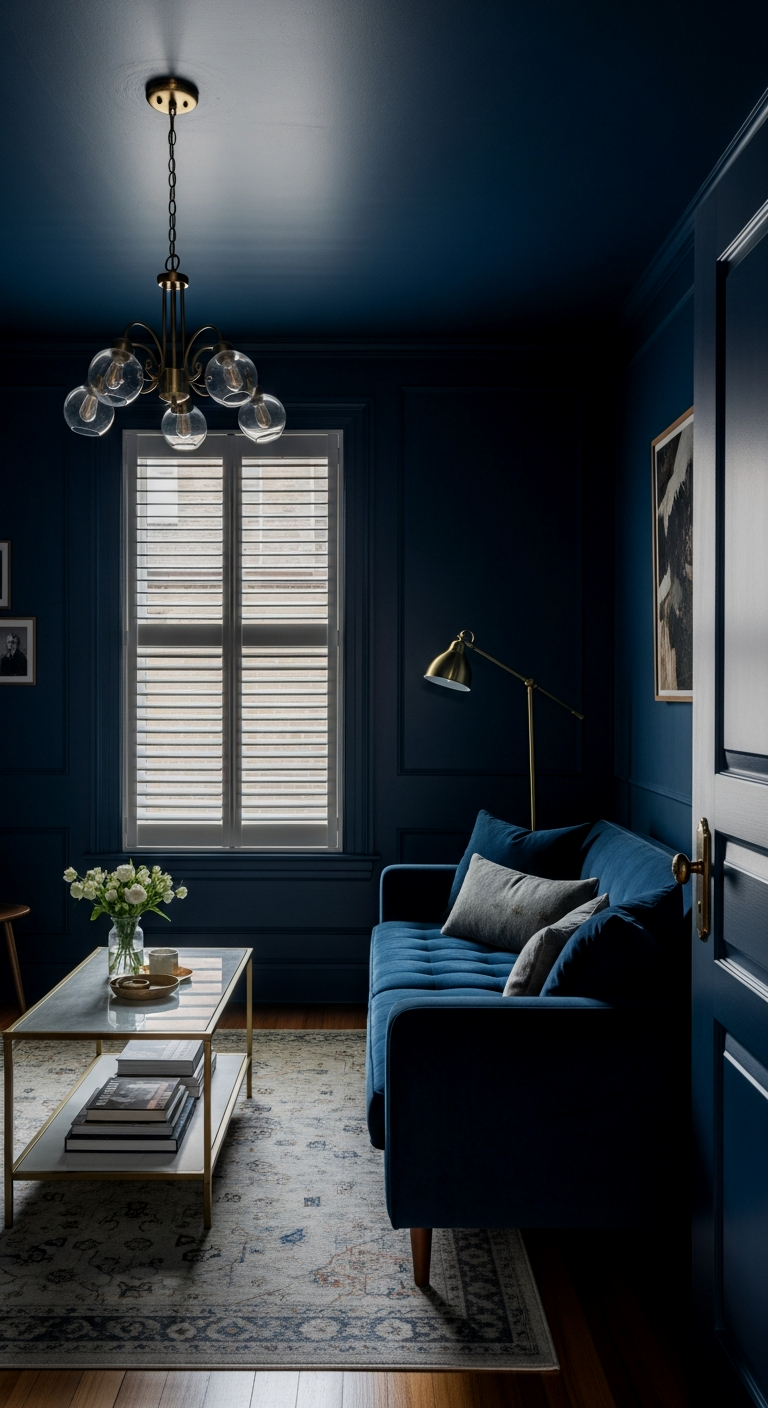
There is a reason Benjamin Moore’s Hale Navy is a cult classic. In a small living room, this deep, moody blue creates an illusion of infinite space. Because it’s so dark, the eye can’t quite figure out where the walls end, especially in the evening. Trust me on this one: if you use a matte finish, it absorbs light in a way that feels incredibly luxurious and grounding. This is the one if you want that “expensive library” vibe without actually having the square footage for one.
Swiss Coffee for Warmth without the Cliché
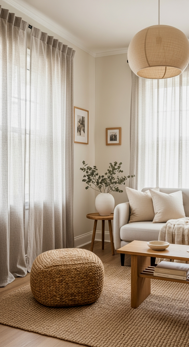
If you absolutely must go light, do not reach for a stark, cool white. Benjamin Moore’s Swiss Coffee is the best kept secret for making a small room feel cozy rather than sterile. It has just enough warmth to feel like a hug, but it’s crisp enough to keep things looking modern. It’s genuinely life-changing because it works in almost any lighting condition—it won’t turn yellow and it won’t look blue. It’s the perfect backdrop for layered textures and wood tones.
Agreeable Gray to Blur the Corners
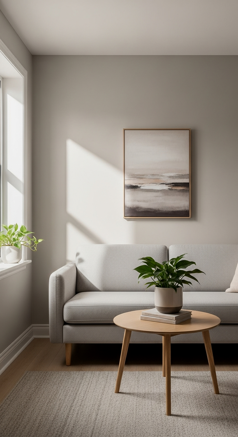
I know, I know—gray has been everywhere. But Sherwin Williams’ Agreeable Gray is a “greige” that actually lives up to the hype. This changed everything for me when I realized it’s the ultimate color for “blurring” the corners of a room. Because it sits right between warm and cool, it softens the transition between the walls and the ceiling. It’s subtle, but the difference is unreal once you get your furniture in place.
When painting a small room a bold or dark color, paint your baseboards and window trim the exact same color and finish as the walls. This “color drenching” technique prevents the eye from stopping at the floor line, making the ceilings feel feet taller than they actually are.
Setting Plaster for an Earthy Glow
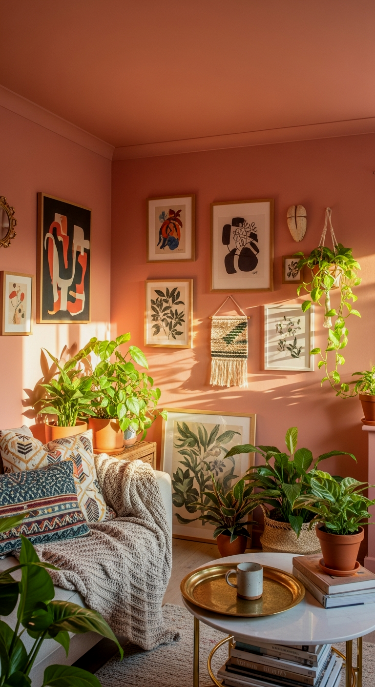
Farrow & Ball has a way with pigments that other brands just can’t match, and Setting Plaster is proof. It’s a dusty, sophisticated pink that feels more like a neutral than a “color.” In a small living room, it gives off this soft, earthy glow that makes everyone look like they’re filtered by sunset light. You will not regret this if you’re looking for something that feels high-design but still incredibly approachable and calming.
Sage Wisdom for a Natural Sanctuary
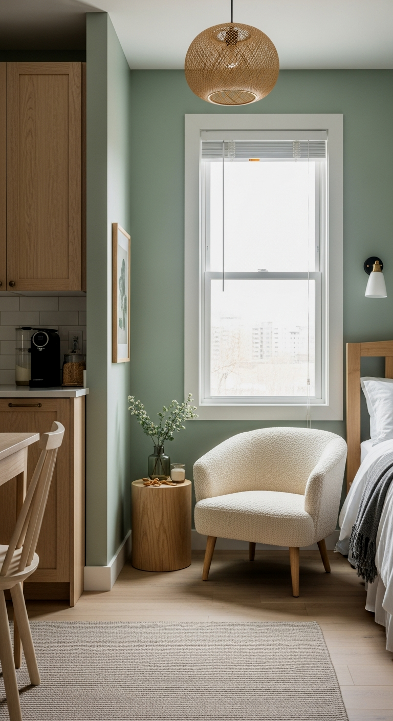
Sage Wisdom by Benjamin Moore is the answer for anyone who feels trapped by their four walls. It brings the outdoors in, creating a natural sanctuary that feels much larger than its footprint. No seriously, green is a receding color, meaning our eyes perceive it as being further away than it is. It’s like a magic trick for your floor plan.
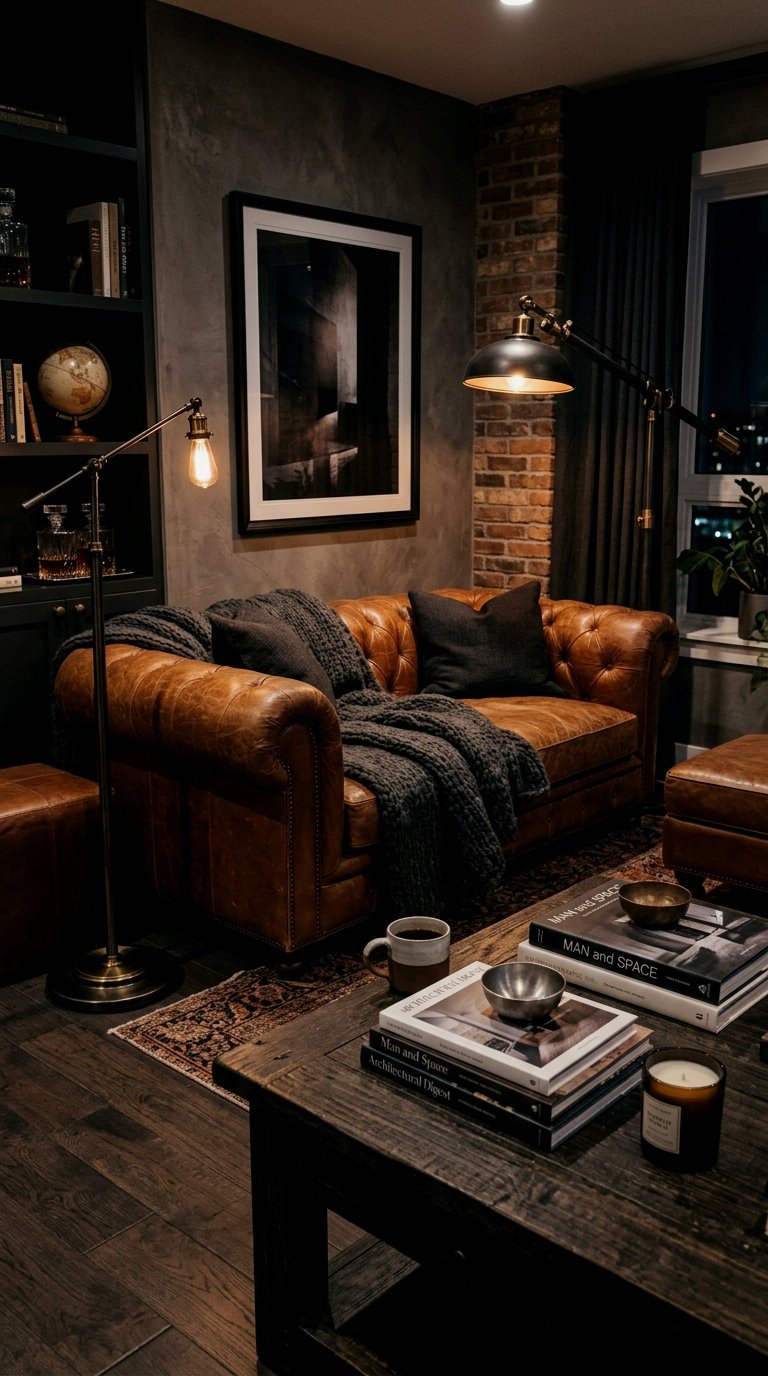
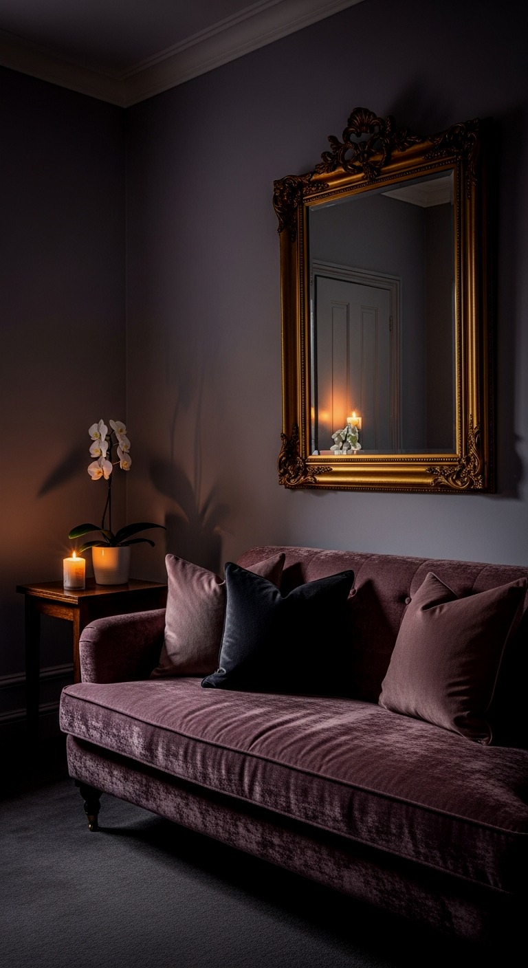
Iron Ore for Modern Sophistication
If you really want to go for it, Sherwin Williams’ Iron Ore is the way to go. It’s not a flat black; it’s a deep, charcoal gray that feels soft and velvety. Once you try this you cannot go back to boring neutrals. It creates such a strong sense of mood that you don’t even notice the room is small—you just notice how sophisticated and cozy it feels. It is the ultimate “small space power move.”
Manchester Tan for Timeless Texture
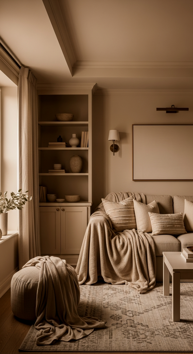
Manchester Tan is another Benjamin Moore heavyweight that deserves more love. It’s a sophisticated beige that has a bit of a “linen” feel to it. I love it because it provides a timeless texture to the walls without feeling heavy. I cannot stress this enough: if you have a lot of black or metallic accents in your living room, this color provides the perfect organic balance to keep the room from feeling too cold.
The exact pieces that make these ideas work:
Vardo for Vibrant Depth
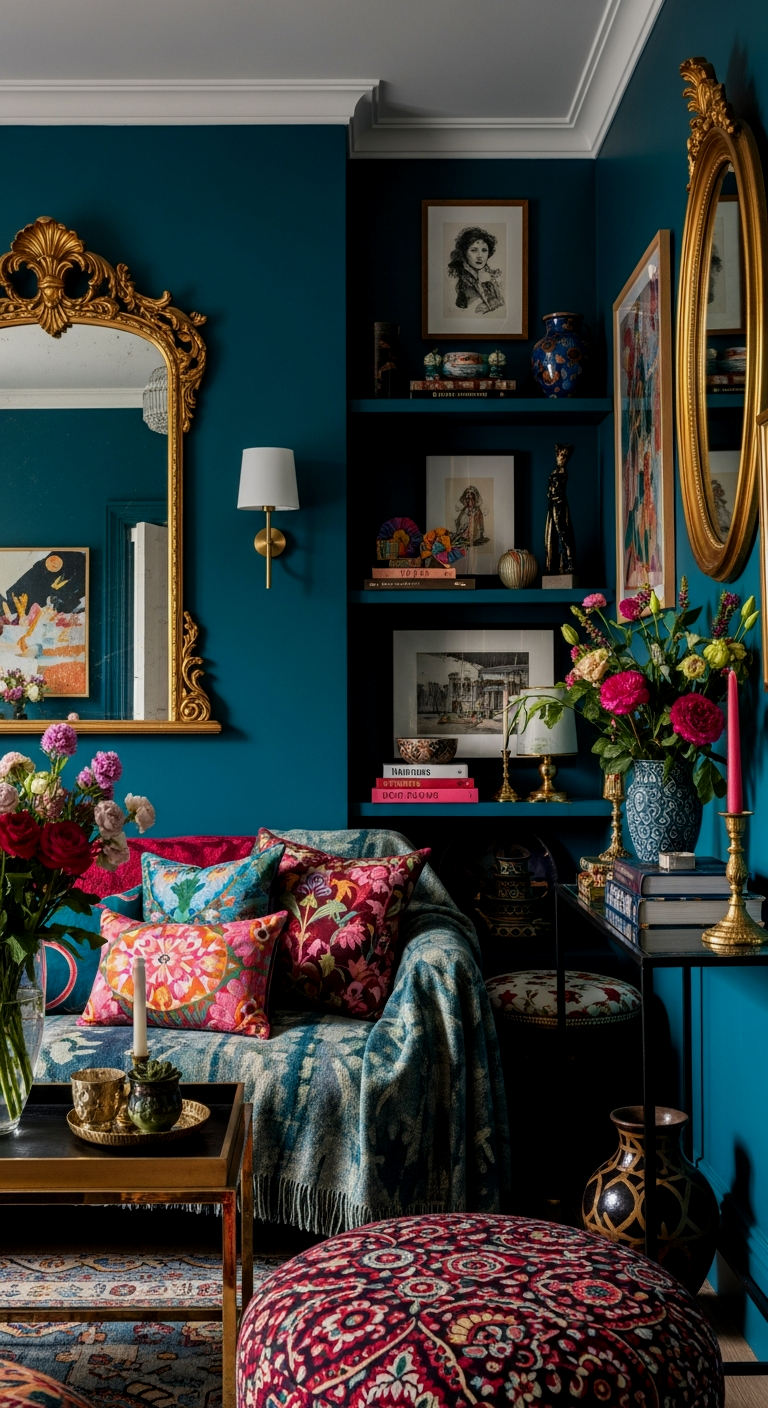
For my color lovers, Farrow & Ball’s Vardo is a showstopper. It’s a teal that manages to be both bright and deep at the same time. This alone is worth it if you’re trying to distract from a lack of architectural interest in a small apartment. It’s vibrant enough to be a personality piece but dark enough to keep the room feeling intimate and intentional.
Redend Point for a Clay-Toned Retreat
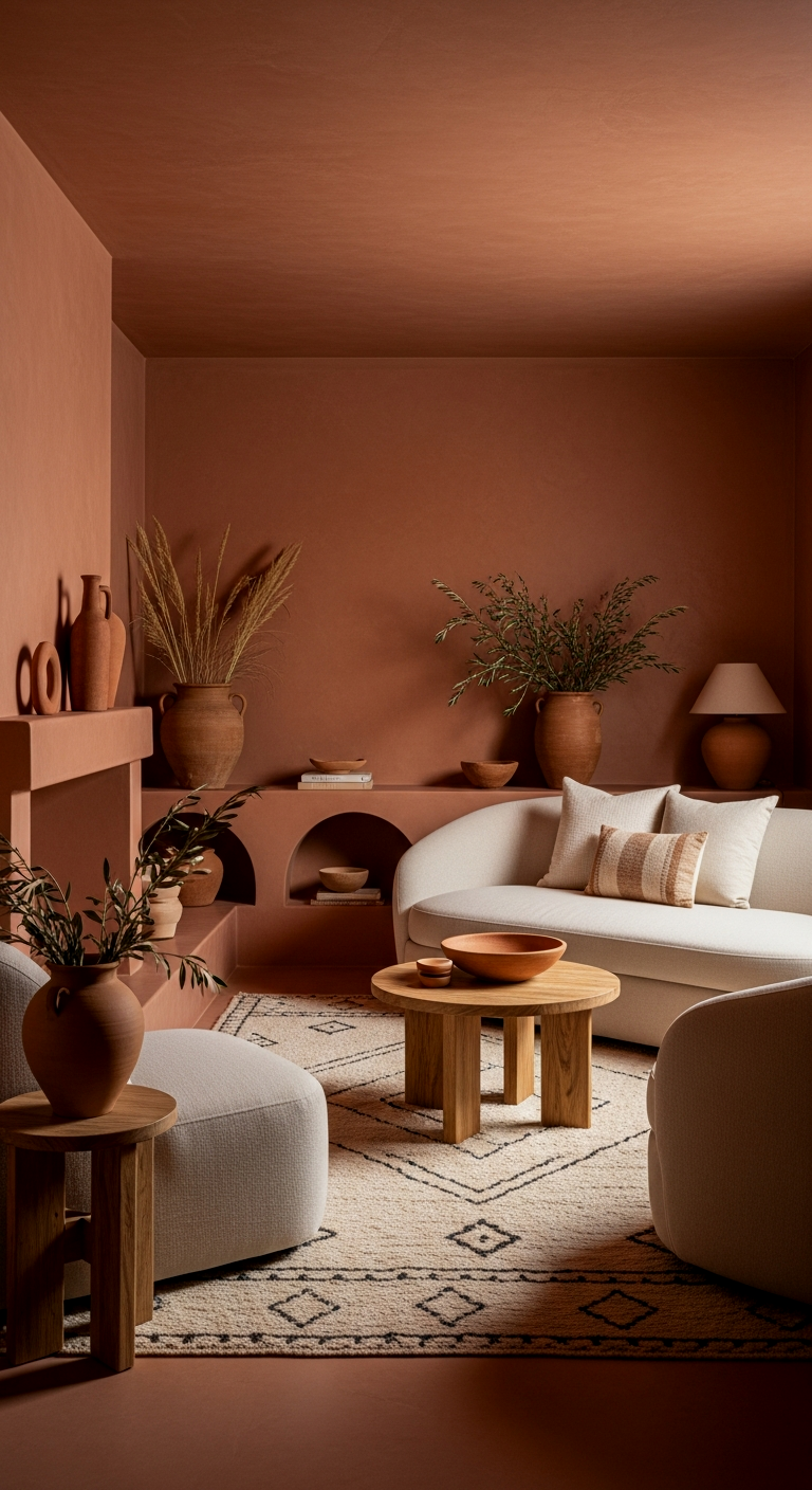
Redend Point by Sherwin Williams was a color of the year for a reason. It’s this beautiful, clay-toned mauve that feels like a warm hug. I wish someone had told me sooner that these mid-tone “terracotta” shades are actually incredible for small rooms because they feel so organic. It turns a tiny living room into a retreat that feels like it belongs in a desert spa.
Breath of Fresh Air for an Expansive Feel
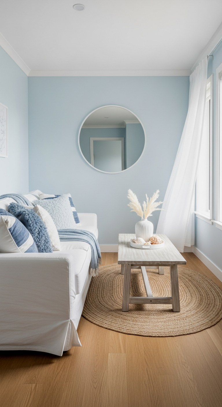
If you want that light and airy feeling but you’re tired of white, Benjamin Moore’s Breath of Fresh Air is the one. It’s a very pale, crisp blue that literally mimics the sky. By painting the walls and the ceiling in this shade, you create an expansive feel that makes the ceiling feel like it’s floating. The results speak for themselves—it’s like adding an extra window to the room.
Peignoir for Moody Romance
Peignoir by Farrow & Ball is a grayish-pink that is just peak moody romance. It’s hazy and ethereal. I’m genuinely obsessed with how this color changes throughout the day. In the morning, it looks like a soft gray; in the evening, it turns into a warm, romantic lavender-gray. It’s a sophisticated way to add “color” without it being overwhelming in a tight space.
Ready to see how these colors look with the right furniture and layout? My ultimate guide covers everything from rug placement to lighting.
📏 12 Paint Colors for Small Living Rooms That Feel Genuinely Life-Changing Quick-Win Checklist
- Finish Matters: Opt for Eggshell or Matte on walls to hide imperfections and reduce harsh glare.
- Ceiling Commitment: If going moody, paint the ceiling to avoid the “closed-in” box effect.
- The 60-30-10 Rule: Use your wall color for 60% of the room to maintain a cohesive flow.
- Lighting Check: Ensure you have at least three light sources (overhead, task, and accent) to make the color pop.
- Sample Large: Paint at least a 2×2 foot square on different walls to see how shadows hit.
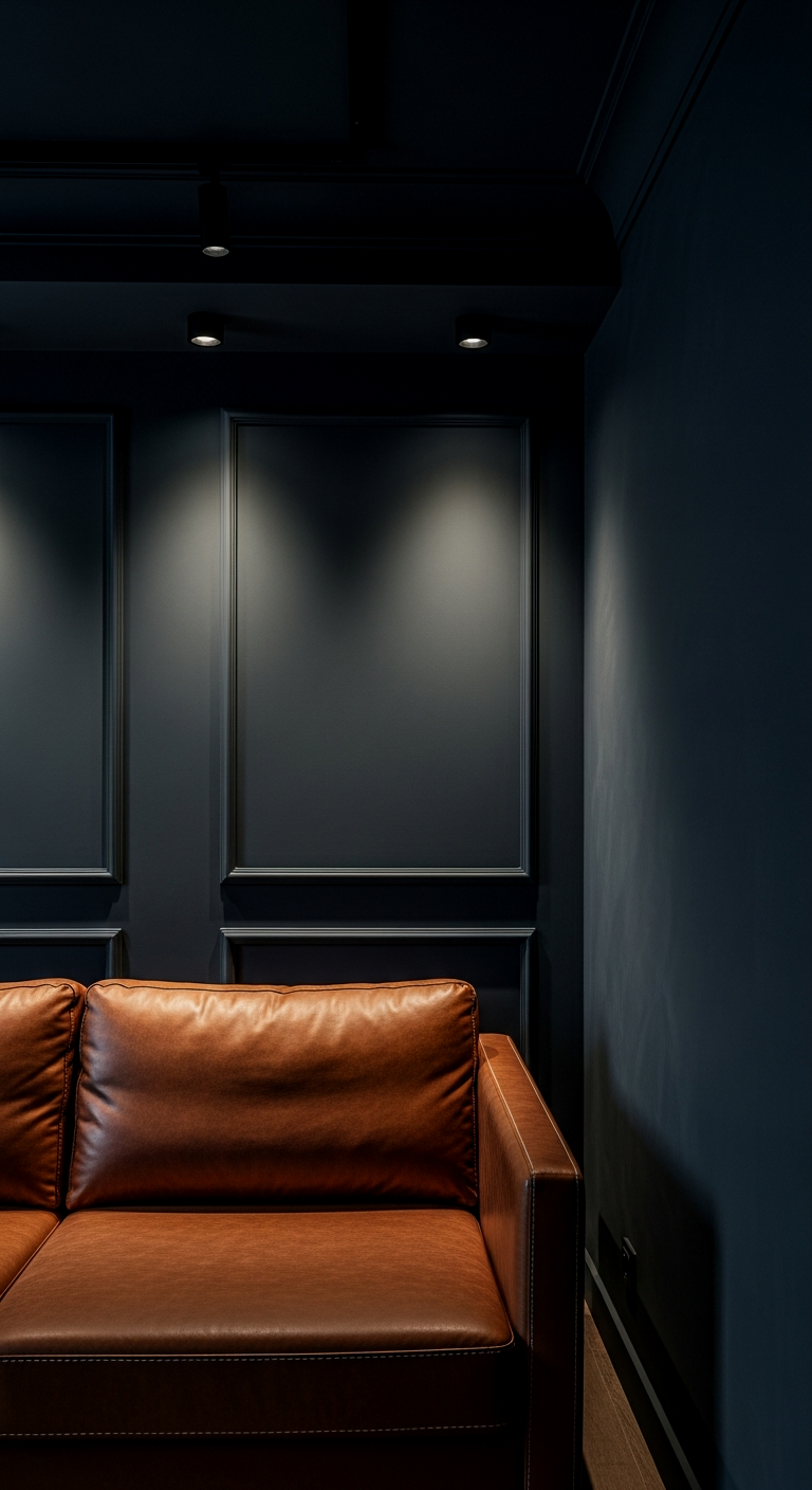
Dark Hunter Green for a Cozy Nook
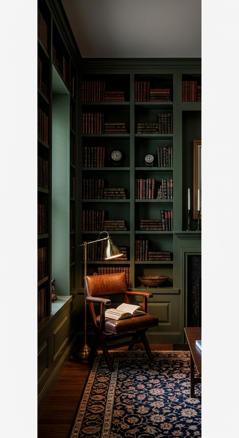
Do not sleep on this: a deep, forest green can make a small living room feel like the ultimate cozy nook. It’s incredibly grounding and looks phenomenal with gold accents and leather furniture. When you go dark with a green like this, the walls seem to move backward, giving you a sense of breathing room you wouldn’t expect. It’s bold, it’s daring, and it’s one of my favorite ways to transform a “boring” room into something special.
At the end of the day, your small living room shouldn’t feel like a limitation—it should feel like an opportunity to be bold. Whether you go for the infinite depth of Hale Navy or the soft glow of Setting Plaster, remember that the “rules” are just suggestions. You deserve a space that feels like a sanctuary, no matter how many square feet you’re working with. For the full picture on how to style these colors, head back over to my 22 Small Living Room Ideas to Transform Your Tiny Space into a Sanctuary guide and let’s get decorating!
FAQ: Painting Small Living Rooms
Should I always use light colors in a small living room?
Not necessarily! While light colors can reflect light, dark colors like Hale Navy or Iron Ore create depth and can actually make the walls “disappear,” which makes the room feel larger in a different, moodier way.
What is the best paint finish for a small room?
Eggshell is usually the gold standard. It has a slight sheen that reflects some light but isn’t so shiny that it shows every bump in your walls. For very dark colors, a high-quality matte finish can look incredibly expensive and velvety.
Should I paint my ceiling the same color as my walls?
Yes! This is one of the best tricks in the book. By removing the white line at the top of the wall, you trick the eye into seeing more height and less of a “boxy” feel.
How do I choose between warm and cool tones?
Look at your natural light. If your room faces North (bluer, cooler light), go for a warmer tone like Swiss Coffee to balance it out. If your room gets a lot of afternoon sun, a cooler gray or blue can help keep things feeling crisp.
Will a dark color make my room feel like a cave?
Only if you don’t have enough lighting! The key to dark walls is layering your light. Use floor lamps, table lamps, and even wall sconces to create “pools” of light that make the dark paint feel intentional and cozy rather than dark and dreary.