Bathing the Room in Light: Little Kitchen Color Ideas for a Nurturing Home
I remember the first time I stood in my very first tiny kitchen, feeling a bit defeated by how the heavy, dark cabinets seemed to lean in on me. I had tried to “fix” the gloom by painting the walls a generic beige I found on sale, but instead of feeling bright, the room felt like a bowl of lukewarm oatmeal. It was a disheartening discovery to realize that color isn’t just something you slap on a wall; it is a conversation between the surfaces and the sun. Finding the right palette for a small space isn’t about hiding its size, but about inviting the light to stay a little longer and rest on the surfaces we use to nourish our families.
When you are looking for loving little kitchen ideas to maximize your space, color is often your most faithful ally. It has the power to lift the ceiling, push back the walls, and create a sense of breath where things once felt tight. We must remember to be gentle with ourselves during this process. It is perfectly fine to change your mind or feel overwhelmed by a sea of paint chips. Take your time, trust your instincts, and let’s explore how we can bathe your kitchen in the light it deserves.
✨ Before You Start: Bathing the Room in Light: Little Kitchen Color Ideas Mindset
The Wisdom of Soft Whites
There is a beautiful wisdom in choosing colors that mimic the natural elements of a slow morning. In a smaller kitchen, the goal is often to encourage the eye to move smoothly from one corner to the next without a jarring stop. By understanding the dance of undertones, we can make even the most compact room feel like it has room to breathe and grow.
The Warmth of Creamy Undertones
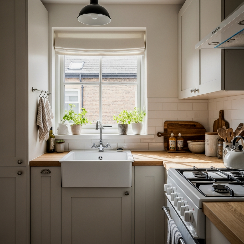
Creamy whites are like a soft wool blanket for your walls. Unlike stark, clinical whites, these shades have a hint of yellow or red that catches the light and softens the edges of your cabinetry. If your kitchen faces north and receives that slightly blue, chilly light, a creamy undertone will balance that coolness, making the space feel inhabited and loved. It’s a wonderful way to ground the room while still keeping it airy.
When choosing a cream, look for “biscuit” or “linen” in the name; these often have the most natural, sun-drenched feel without turning too yellow under artificial bulbs.
Crisp Cool Whites for Openness
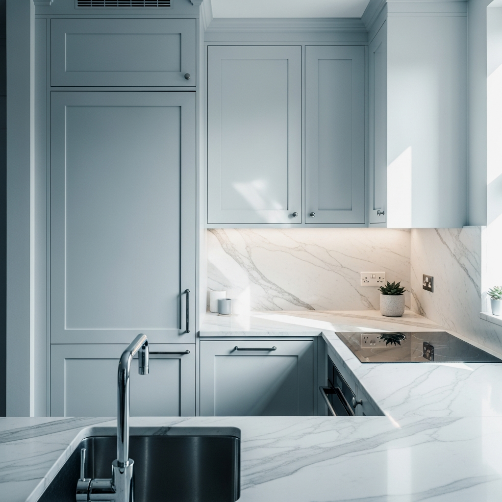
For those kitchens that are blessed with plenty of Southern sun, a crisp, cool white can be incredibly refreshing. These whites often have a tiny touch of blue or gray, which helps the walls “recede,” making the room appear larger than it truly is. It creates a clean, focused backdrop that allows your colorful bowls or a vase of fresh herbs to really sing. It’s a disciplined choice that rewards you with a sense of limitless space.
To keep a cool white kitchen from feeling cold, introduce warm metal accents like brass or copper in your cabinet hardware or faucet.
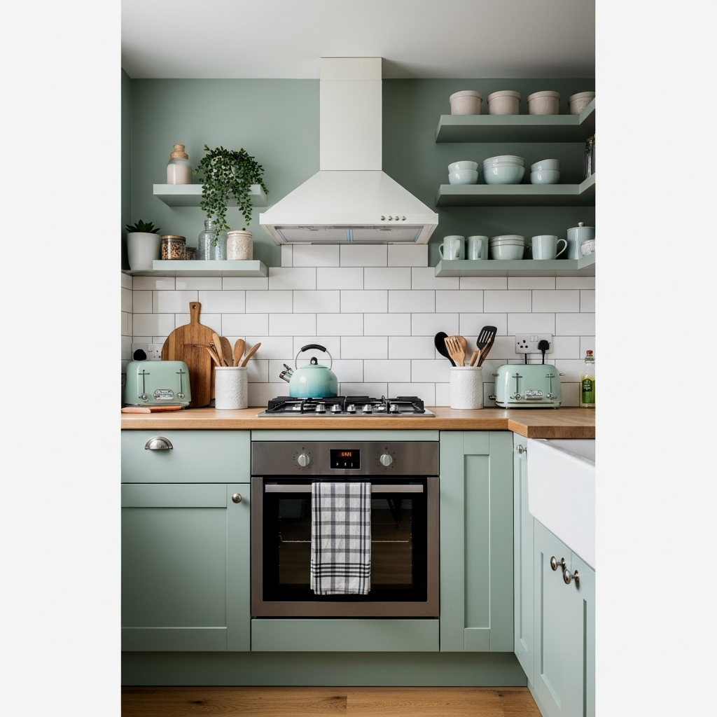
Grounding with Sage Green
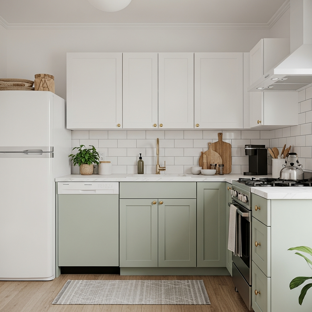
I find that many people are afraid of color in small spaces, but a soft sage green on the lower cabinets can act as a beautiful anchor. It brings the outside in, reminding us of quiet gardens and fresh growth. By keeping the upper walls a lighter neutral and using sage below, you ground the room without sacrificing that precious sense of height. It is a very nurturing color that pairs beautifully with wood tones and natural stones.
Follow the 60-30-10 rule: Use a light base color for 60% of the room (walls), a grounding secondary color like sage for 30% (lower cabinets), and a sparkling accent for the final 10% (hardware or decor).
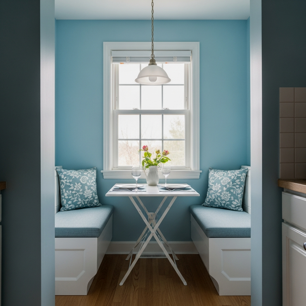
Serene Pale Blue Accents
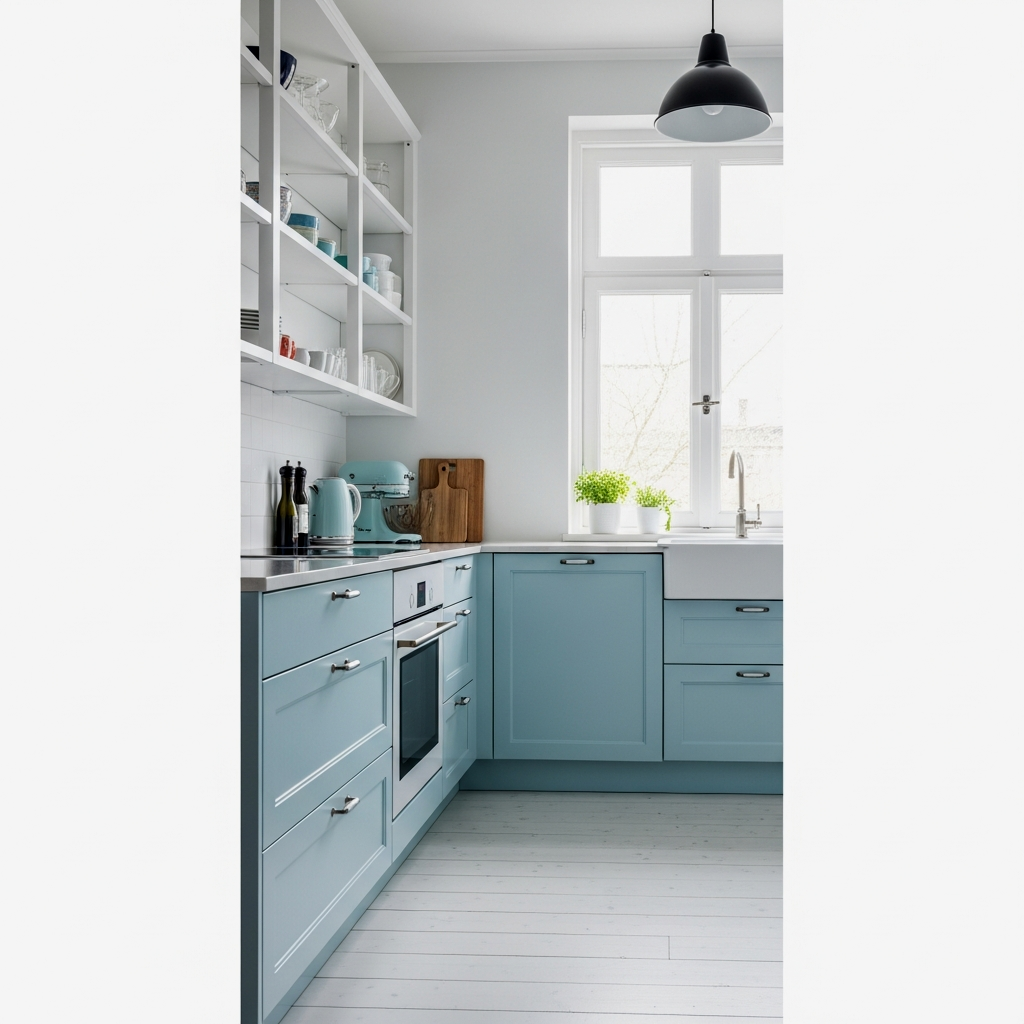
Pale blue is the color of the sky just before the sun fully wakes up. In a kitchen, it can provide a serene, almost weightless feeling. When used on a backsplash or as an accent on a kitchen island, it draws the eye and provides a focal point that feels expansive. It’s a gentle way to introduce personality while maintaining a calm, orderly atmosphere. This works particularly well when integrated with soft little kitchen decorating ideas that emphasize comfort.
Try a “duck egg” blue if you want something with a bit more depth; it hides small smudges better than a true sky blue while remaining light and airy.
The Science of Light and Swatches
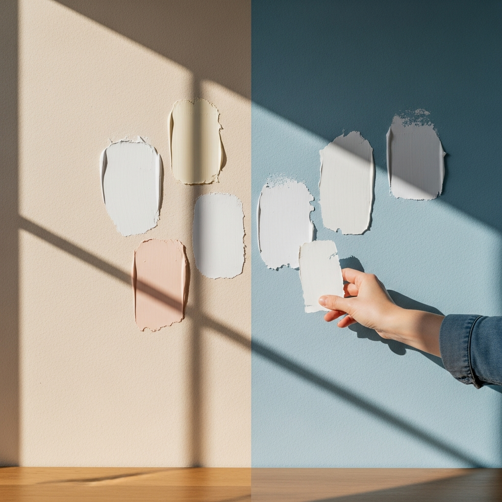
One of the most important lessons I’ve learned is to never pick a paint color based on a single glance in the hardware store. The science of how light bounces off a swatch is fascinating. You must trust the process of testing. Paint a large square on different walls and watch it for twenty-four hours. See how it looks during a gray rainstorm and how it glows under your warm kitchen lighting at night. This patience ensures you won’t be surprised by an unwanted undertone later.
Reflective Glossy Finishes
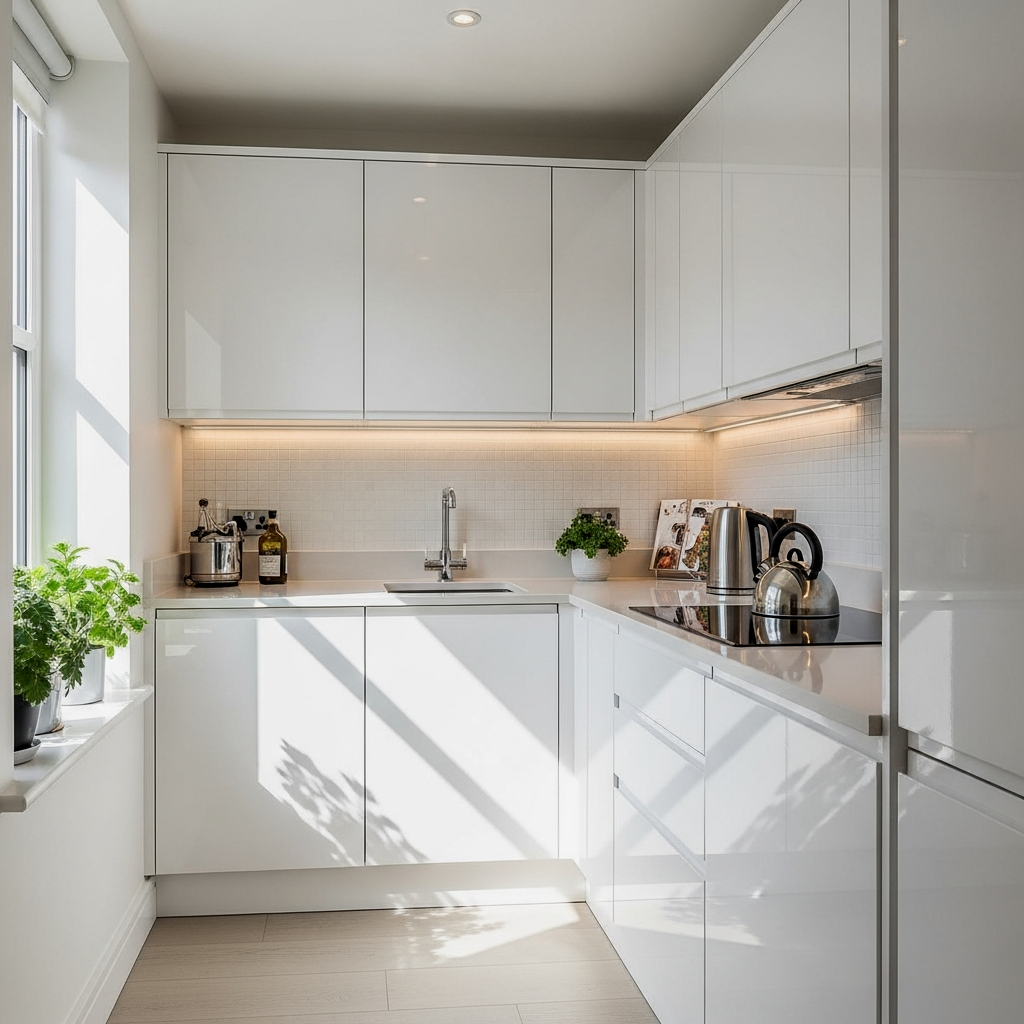
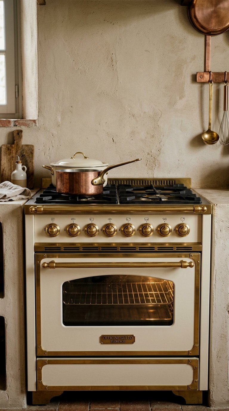
When we talk about color, we must also talk about finish. In a small kitchen, a semi-gloss or satin finish on the cabinets can be a miracle worker. These finishes act like tiny mirrors, bouncing light back into the room rather than absorbing it. Even a darker color, if given a bit of a sheen, can feel much lighter and more dynamic than a flat, matte version of the same shade. It’s a practical way to add “glow” to your surfaces.
If your walls have many imperfections, stick to a “pearl” finish—it offers the light-reflecting benefits of gloss but is much more forgiving of bumps and bruises.
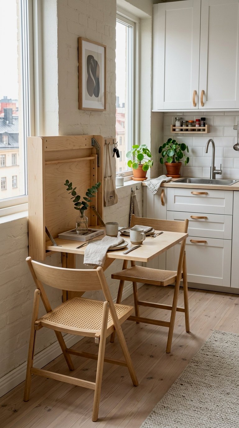
Heart of the Home: Airy Open Shelving
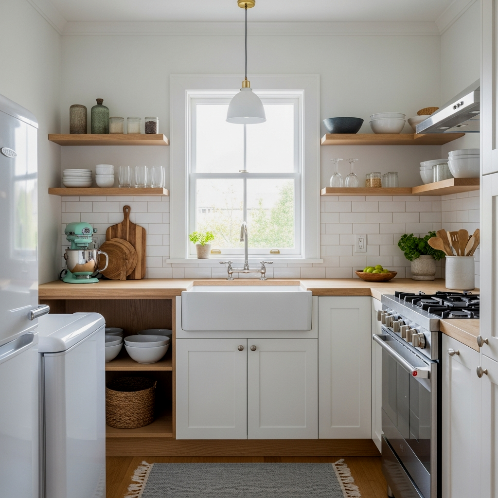
Color isn’t just about paint; it’s about what we see. Replacing heavy upper cabinets with airy open shelving allows the wall color to continue uninterrupted, which immediately makes the room feel wider. When you paint these shelves the same color as the walls, they almost disappear, leaving your pretty mugs and plates to float in the light. It encourages a sense of openness that traditional cabinetry often blocks. This is a core concept when finding your flow in a small layout, as it removes visual “bulk” at eye level.
The exact pieces that make these ideas work:
Soft Neutrals and Natural Textures
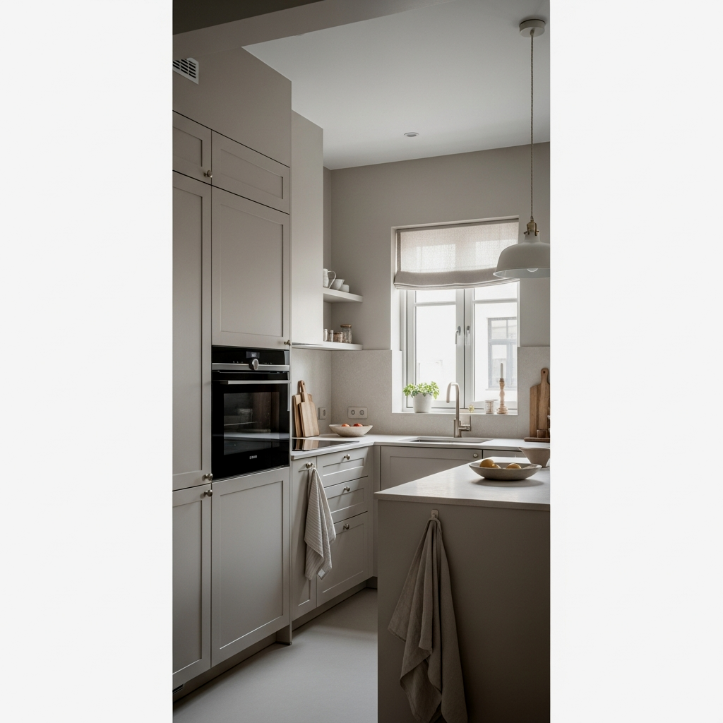
Sometimes the best color is one that feels like it has been there forever. Soft neutrals like oatmeal, sand, or a very light taupe bring a sophisticated warmth to the kitchen. These colors work best when paired with natural textures—think a jute rug or a wooden breadboard. The texture adds “visual weight” that keeps a light color from feeling flimsy or cheap. It’s about creating a space that feels layered and lived-in, even if it is small.
To find the perfect neutral, look at the “greige” family—colors that sit right between gray and beige. They adapt beautifully to both warm and cool light sources.
Monochromatic Depth in Tiny Spaces
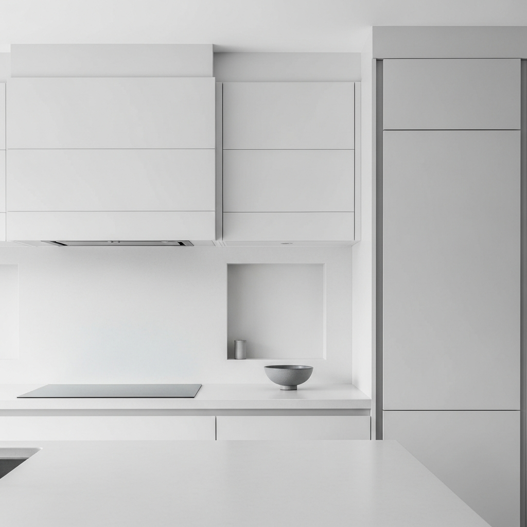
There is a quiet elegance in a monochromatic palette. By using different shades of the same color—perhaps a deep mushroom on the cabinets and a very pale mist on the walls—you create depth without cluttering the eye with too many different hues. This “tone-on-tone” approach makes the room feel cohesive and expensive. It allows the architecture of the kitchen to be the star, rather than the paint itself.
Luminous Subway Tile Reflections
A classic white subway tile backsplash is a favorite for a reason. Its glassy surface is one of the best ways to catch and throw light around a small kitchen. When you pair a light wall color with a high-gloss tile, you create a “light box” effect that brightens your workspace immensely. It’s a timeless principle of design: use your vertical surfaces to amplify whatever natural light you have available.
Use a light-colored grout (like silver or light gray) instead of stark white or black; it creates a softer, more continuous look that feels less “grid-like” in a tiny area.
Morning Light on Pale Surfaces
The way a kitchen looks at 7:00 AM can set the tone for your whole day. Pale surfaces—whether they are light quartz countertops or a pale ash wood floor—catch that early morning glow and make the space feel full of promise. If you can, try to keep your largest surfaces light in color. This ensures that even on the gloomiest winter mornings, your kitchen remains a cheerful place to boil the kettle and start your day.
If your kitchen is very small, paint your ceiling the same color as your walls, but use a “flat” finish. This removes the visual line where the wall ends and the ceiling begins, creating an illusion of much taller walls and a truly “bathed in light” effect.
Golden Hour Glow in the Kitchen
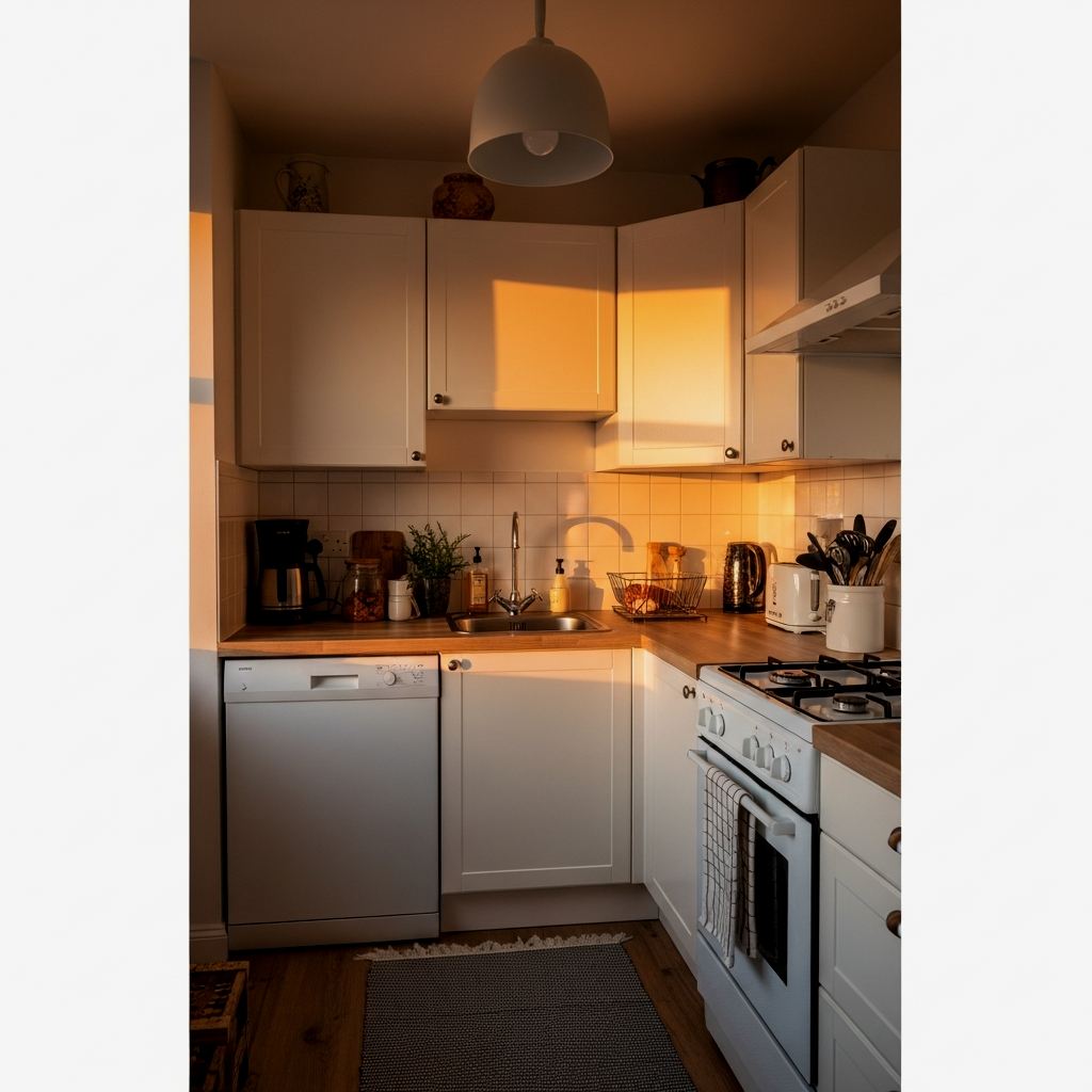
Finally, consider how your colors react to the “golden hour” in the late afternoon. This is when colors with warm undertones truly shine. A kitchen that can transition from a crisp, productive morning space to a warm, glowing evening sanctuary is a successful one. By choosing colors that have a bit of “soul”—shades that aren’t too flat or too gray—you ensure that your kitchen feels like the heart of the home at every hour.
📏 Bathing the Room in Light: Little Kitchen Color Ideas Quick-Win Checklist
- Identify Your Light: Does your kitchen face North (cool light) or South (warm light)?
- Test Three Swatches: Pick a warm white, a cool white, and a “greige” to see which reacts best.
- Check the Gloss: Ensure your cabinet paint has at least a satin finish for reflection.
- Look Up: Consider painting the ceiling a soft off-white to lift the space.
- Small Accents: Choose one grounding color for lower cabinets or a small island.
Creating a light-filled kitchen is a journey that requires a bit of patience, but the rewards are so worth it. When you finally find that perfect shade that makes your small space feel like it’s expanding with every sunrise, you’ll feel a sense of peace every time you walk in. Remember, you don’t have to do it all at once. Celebrate the small win of a successfully tested swatch or a newly painted shelf. If you’re looking for more ways to nurture your space, our guide on the heart of the home offers a full picture of how to combine color, storage, and love into one tiny, perfect kitchen. Enjoy the process, and trust that your home will tell you when the light is just right.
Frequently Asked Questions
Should I use matte or gloss paint in a small kitchen?
In a small kitchen, gloss or satin finishes are generally better for cabinets and trim because they reflect light, making the room feel larger. Matte paint is lovely for walls if they have imperfections you want to hide, but it tends to absorb light rather than bounce it around.
What is the best color for a kitchen with no windows?
For a windowless kitchen, “Warm White” is often the best choice. Since you rely entirely on artificial light, a warm white prevents the room from feeling like a basement or a closet. Pair it with high-quality LED bulbs that mimic natural daylight to keep the space feeling fresh.
Will dark colors always make a small kitchen look smaller?
Not necessarily! If you use a dark color on just the lower cabinets or a single accent wall, it can provide depth and “ground” the room. The trick is to keep the majority of the eye-level surfaces light and reflective so the overall feeling remains airy.
How do I choose a white that doesn’t look yellow?
Look for whites with “cool” undertones, often labeled with words like “pearl,” “mist,” or “frost.” Always test these against a piece of pure white printer paper; if the paint chip looks yellow next to the paper, it will likely look even more yellow on your walls under warm light.
Can I use more than two colors in a tiny kitchen?
Yes, but it’s best to keep them in the same family. Using a monochromatic scheme (different shades of the same color) or a simple three-color palette (base, anchor, and accent) prevents the small space from feeling cluttered or chaotic to the eye.