15 Japandi Living Room Color Palette Ideas That Are Genuinely Life-Changing
Trust me on this one, the secret to a great Japandi room is the ‘earthy’ undertone, not just plain white paint. I wish someone had told me sooner that ‘cool’ whites kill the vibe. I spent months wondering why my space felt like a sterile doctor’s office instead of a cozy sanctuary, and it all came down to those icy blue undertones hiding in my “eggshell” walls. This changed everything for me when I started layering different shades of the same neutral tone. When you’re looking through 25 Japandi living room ideas to finally master the art of Zen minimalist style, you’ll notice that the pros never use a flat color—it’s all about that subtle, muddy warmth.
✨ Before You Start: 15 Japandi Color Palette Ideas That Are Genuinely Life-Changing Mindset
The Essential Japandi Color Palettes
Mushroom & Sandstone Harmony
No seriously, this is the combination that makes a room feel like a warm hug. It’s not beige, and it’s not grey—it’s that perfect “in-between” that mimics the floor of a forest. By using a mushroom tone on the walls and sandstone for your larger furniture pieces, you create a soft transition that feels expensive and intentional without trying too hard.
Layered Oatmeal & Flax Neutrals
If you love a monochromatic look, this is how you do it without it looking flat. The key here is the “layered” part. Think of a flax-colored linen sofa against oatmeal-painted walls. The slight shift in saturation creates depth, making the space feel expansive yet incredibly grounded.
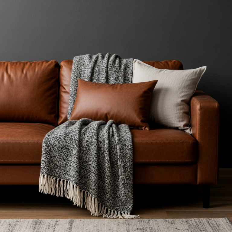
Charred Timber & Soft Grey Contrast
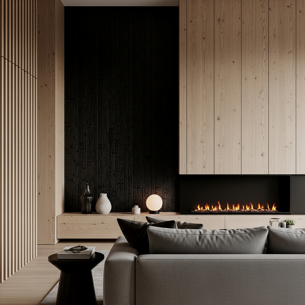
This is where the Japanese influence really shines. I love the “wabi-sabi” feel of a dark, charred timber (think Shou Sugi Ban) paired with a very soft, misty grey. The results speak for themselves—it’s moody, sophisticated, and provides that hit of visual weight that minimalist rooms often lack.
Use the 60-30-10 rule but apply it to texture rather than just pigment: 60% matte finishes (walls), 30% organic textures (wood/stone), and 10% soft textiles (linen/wool).
Sage Green & Warm Clay Earthiness
I am obsessed with how these two play together. The sage green brings in a botanical element that feels very “Zen garden,” while the warm clay keeps it from feeling too cold. It’s an earthy, soulful palette that works beautifully in rooms with lots of indoor plants.
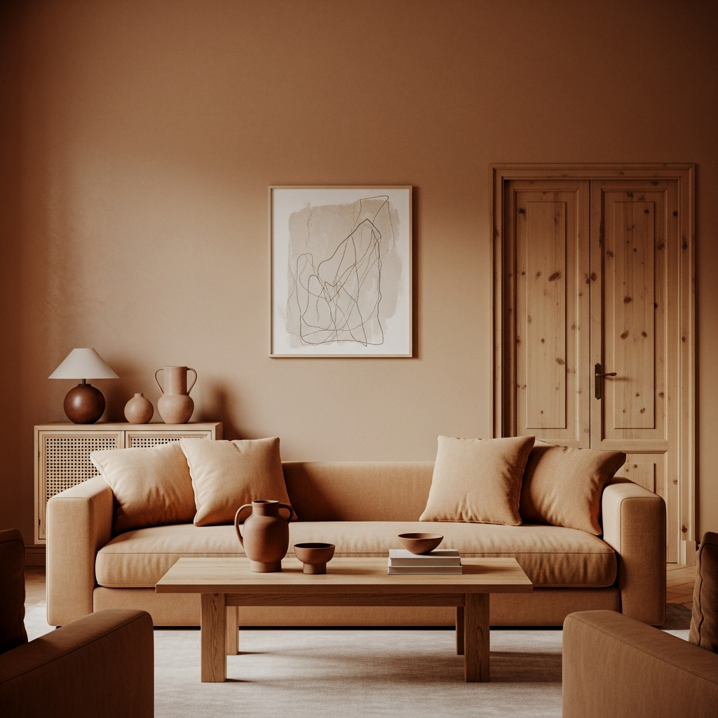
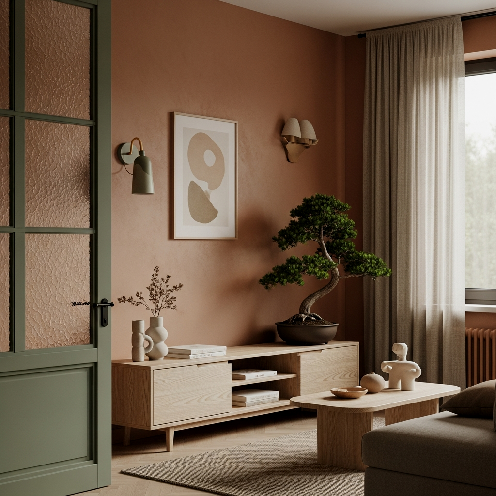
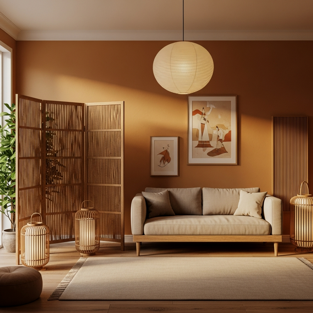
Dusty Terracotta & Natural Oak
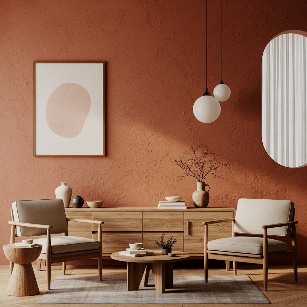
Forget the bright orange terracottas of the 90s. We’re talking about a sun-baked, dusty rose-meets-brown shade. When you pair this with natural oak furniture, the warmth is unreal. It feels like a permanent golden hour in your home.
Stone Grey & Mossy Undertones
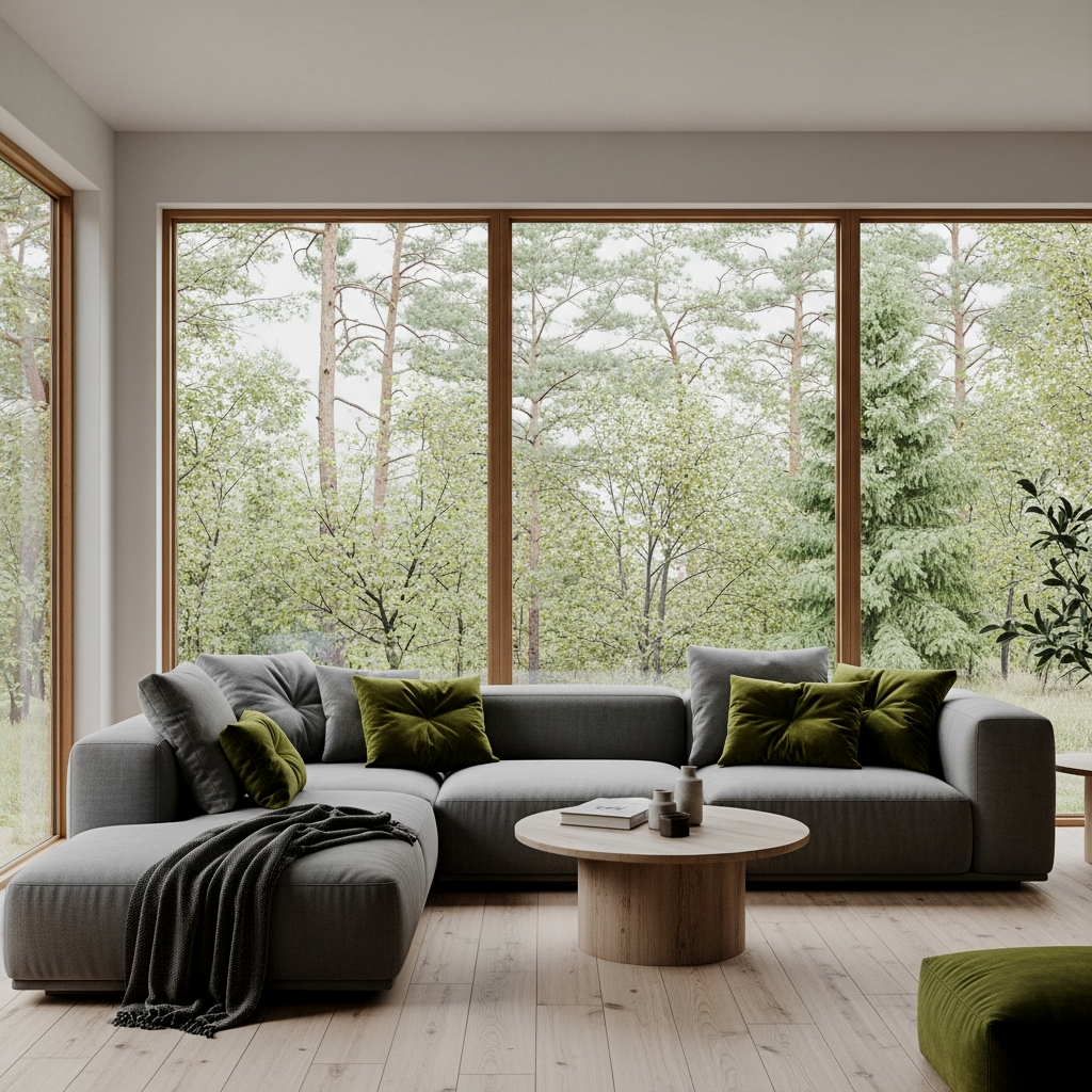
This alone is worth it for anyone who wants a slightly more “European Scandi” vibe with a Japanese twist. The mossy undertones in the grey prevent it from looking like concrete, giving it a living, breathing quality that changes beautifully throughout the day as the sun moves.
Sesame & Walnut Sophistication
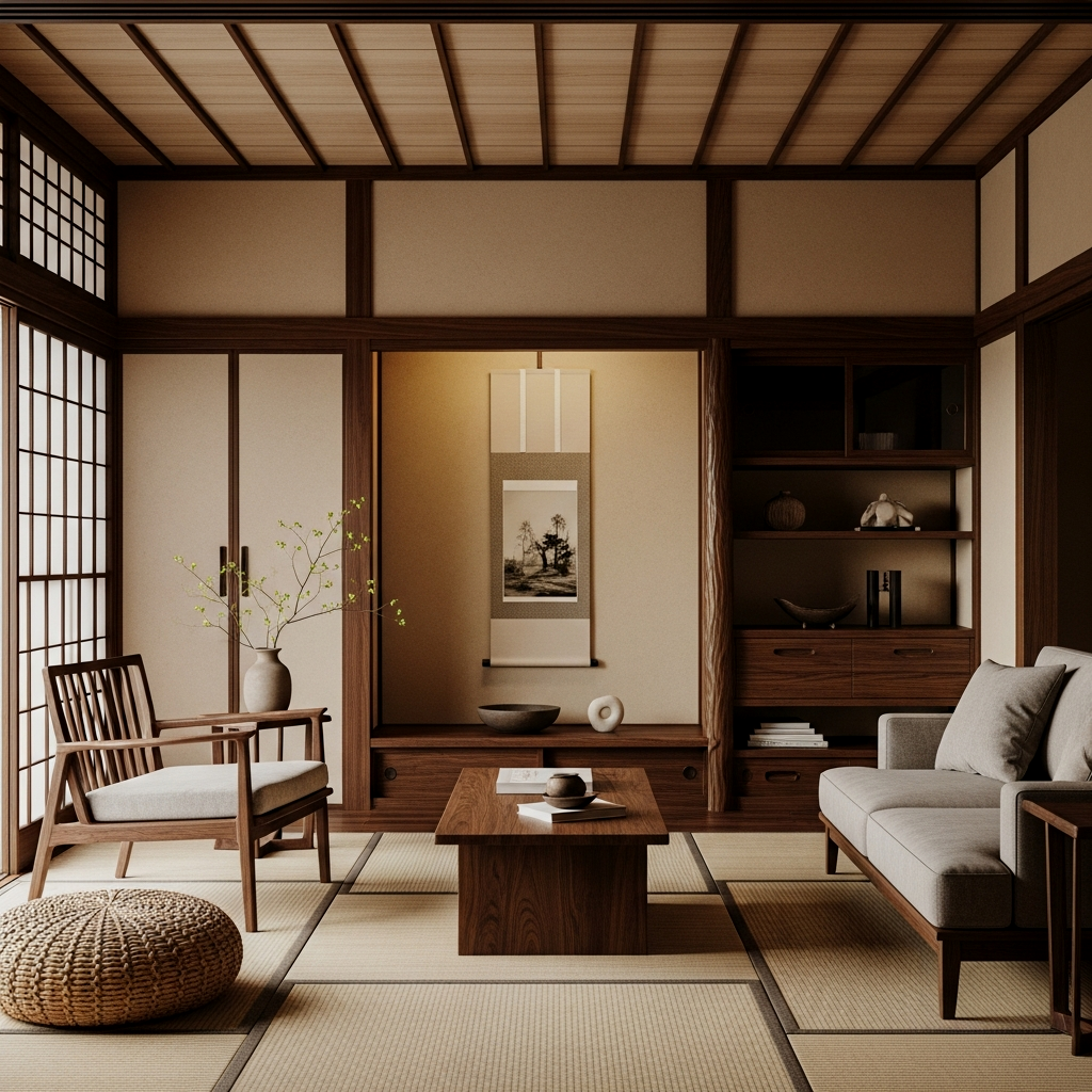
Sesame is that light, toasted cream that serves as the perfect backdrop for walnut wood. Because walnut is so dark and rich, it needs a cream that has enough “body” to stand up to it. This pairing feels incredibly high-end and timeless.
The exact pieces that make these ideas work:
Muted Ochre & Raw Bamboo
The difference is unreal when you swap out bright yellows for a muted, muddy ochre. It brings a “harvest” feel to the room that pairs perfectly with the light, linear look of raw bamboo. It’s cheerful but disciplined, which is exactly what Japandi is all about.
Charcoal & Natural Linen Balance
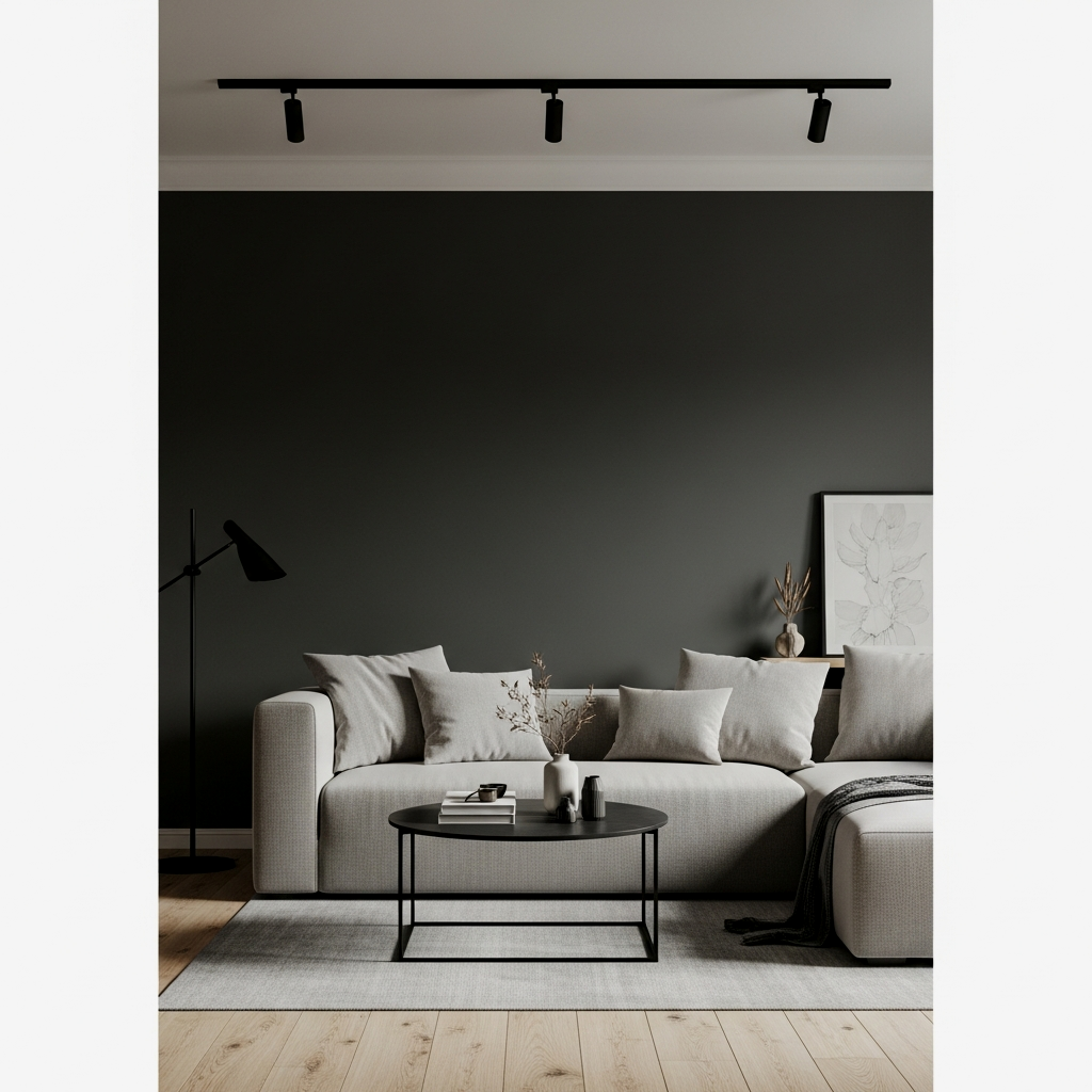
If you’re worried about a room feeling too “beige,” bring in charcoal. Using it on window frames or a single statement chair against natural, unbleached linen creates a striking balance that feels modern yet deeply grounded in nature.
Warm Taupe & Raw Silk Layers
Once you try this you cannot go back to basic greys. Warm taupe has just enough brown in it to feel organic, and when you layer it with the slight sheen of raw silk cushions or rugs, the light bounces around the room in the most ethereal way.
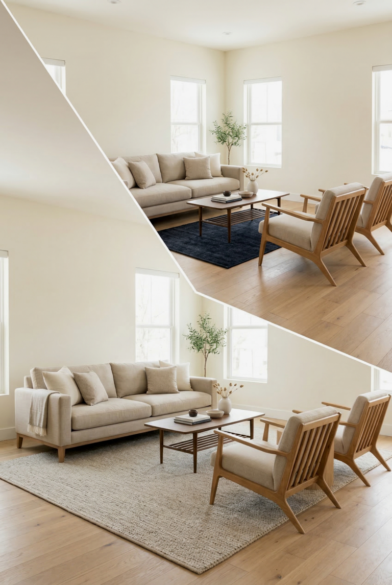
Cloud Grey & Blonde Wood Serenity
This is the classic Scandi-leaning Japandi look. The cloud grey should be very light, almost white but with a “foggy” depth. Pair it with blonde woods like ash or pine to keep the space feeling airy and bright without that clinical “white box” feeling.
The best kept secret for testing Japandi colors is to look at them specifically at 4 PM. This is when the blue light of the day starts to shift, and you’ll see if your “warm” paint choice is actually holding its own or turning into a muddy mess. If it looks good in late afternoon light, it’s a winner.
Deep Forest & Aged Teak Roots
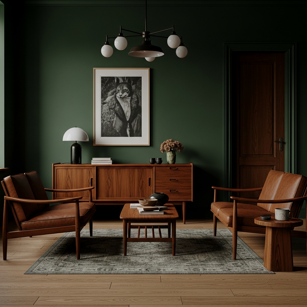
I was not prepared for how good this looks in a small space. A very deep, almost-black forest green on the walls makes the orange-red tones of aged teak pop. It feels like an ancient Japanese forest—dignified, quiet, and incredibly powerful.
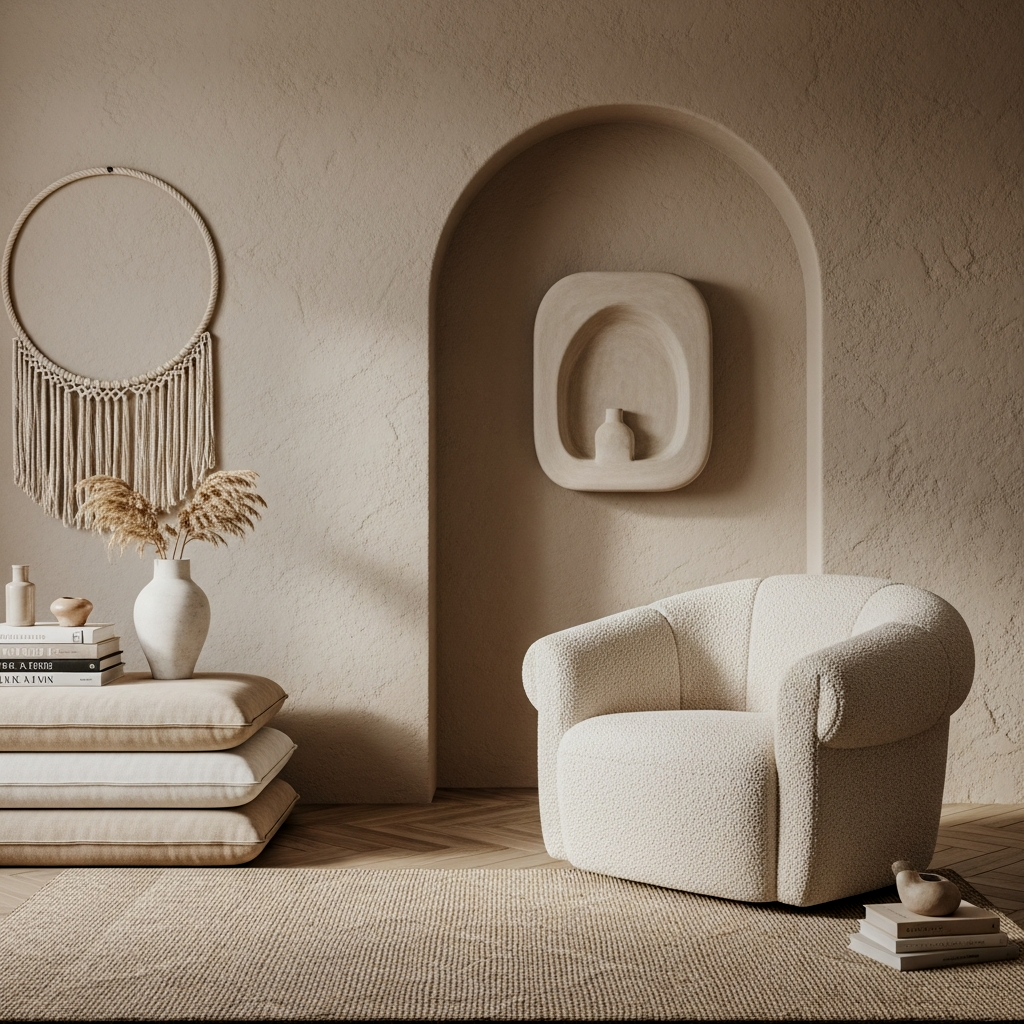
Bone White & Textural Jute
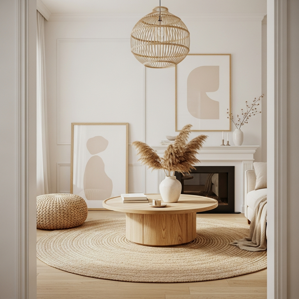
This is the one for the purists. Bone white is softer than stark white, and when you pair it with the rough, chunky texture of a jute rug, you get that perfect “rough meets smooth” aesthetic that defines the Japandi style.
Earthy Umber & Rich Cedar
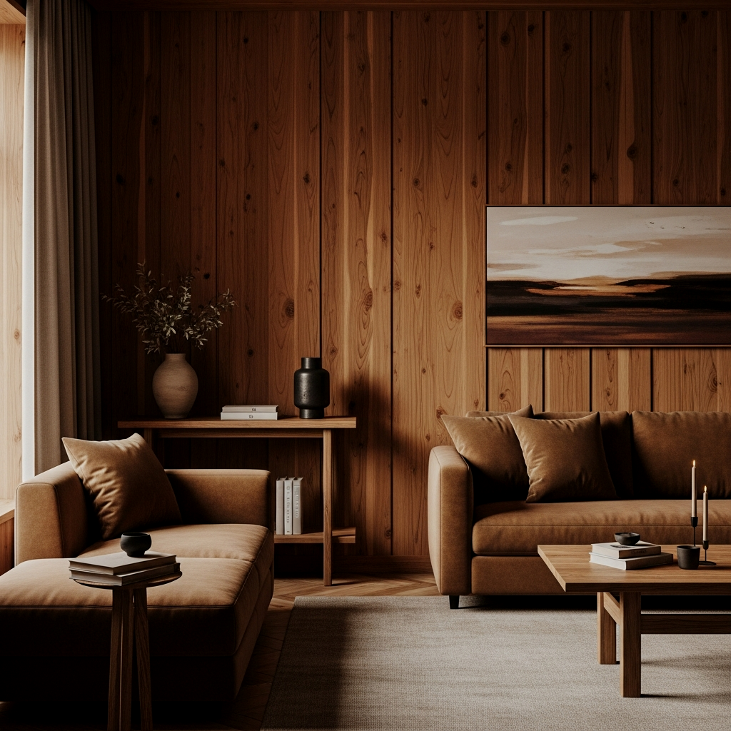
Do not sleep on this darker palette. Earthy umber is a rich, chocolatey brown that, when paired with the reddish warmth of cedar, creates a sensory experience. It feels tactile, warm, and very curated.
📏 15 Japandi Color Palette Ideas That Are Genuinely Life-Changing Quick-Win Checklist
- Check Undertones: Only choose paints with yellow or green bases.
- Mix Wood Tones: Aim for one light wood and one medium/dark wood per palette.
- Limewash is King: Use limewash to add “movement” to flat colors.
- Contrast: Ensure there is at least one “dark” element to anchor the neutrals.
- Sample Large: Paint at least a 2×2 foot square on multiple walls.
The Ultimate Greige & Woven Rattan
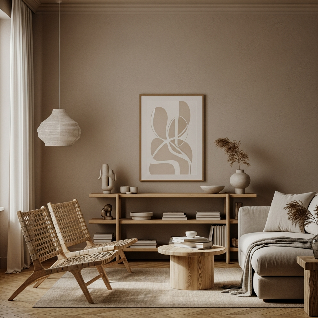
I cannot stress this enough: “greige” was practically invented for Japandi. It bridges the gap between the cool Scandi aesthetic and the warm Japanese one. Pairing a perfect greige with woven rattan elements is genuinely life-changing because it works in literally any light condition and makes everything look instantly cohesive.
Choosing the right colors is really just the beginning of your journey. If you’re feeling inspired and want to see how to pull these shades into a cohesive layout, you absolutely have to check out my 25 Japandi living room ideas to finally master the art of Zen minimalist style. You will not regret taking the time to get the palette right—once your walls and woods are talking to each other, the rest of the decorating becomes so much easier. Happy painting!
FAQ
What is the most common Japandi color?
While many think it’s white, the most common Japandi color is actually “Greige” or a warm, muddy off-white. This shade bridges the gap between the cool-toned minimalism of Scandinavia and the warm, earthy tones of traditional Japanese design.
Can I use black in a Japandi palette?
Absolutely! Black is essential for Japandi, but it’s usually used as an accent. Think of it as the “ink” in a calligraphy painting—use it for slim furniture legs, picture frames, or light fixtures to provide contrast against the lighter neutrals.
How do I make a neutral room not look boring?
The secret is layering textures. If your walls and sofa are both beige, make sure the walls are matte or limewashed and the sofa is a heavy linen or bouclé. The variation in how light hits the different surfaces creates “visual color” even if the pigment is the same.
What wood tones go best with Japandi colors?
Light woods like oak, ash, and pine are classic Scandi choices, while darker woods like walnut and cedar represent the Japanese side. A perfect Japandi palette usually mixes one of each to create a balanced, curated look.
Are “cool” colors allowed in Japandi?
Cool colors are rarely used as the base. If you use a cool color, like a slate blue or a cool grey, it should be balanced with plenty of warm wood and natural textiles to prevent the room from feeling cold or uninviting.