12 Masculine Wallpaper Picks for a Moody, High-End Vibe
I used to think “masculine design” was just a code word for “boring beige” or that specific brand of cold, sterile minimalism that feels more like a doctor’s office than a home. But then I saw a home office wrapped in a deep, textured charcoal that looked like a custom-tailored suit, and honestly, it changed everything for me. We’ve been conditioned to think moody means gloomy, but when you get the texture right? The difference is unreal. It’s about creating a space that feels grounded, intentional, and expensive—even if you’re doing it on a DIY budget.
✨ Before You Start: 12 Masculine Wallpaper Picks for a Moody, High-End Vibe (Trust Me, the Difference is Unreal) Mindset
The Foundation of a High-End Moody Space
Textured Charcoal Grasscloth
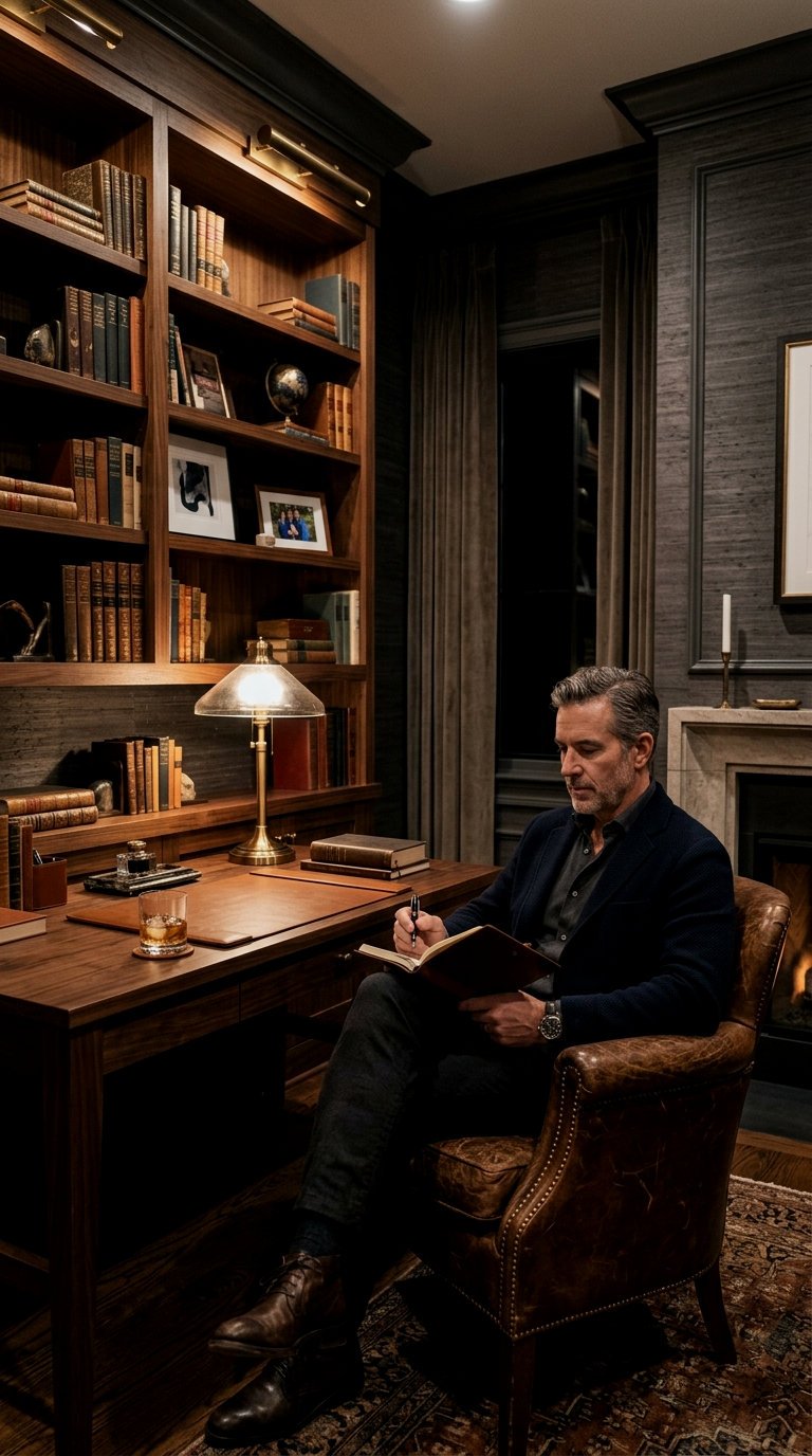
No seriously, if you want a room to instantly feel like a $1,000-a-night hotel suite, grasscloth is the best kept secret. It’s not just a color; it’s a physical presence. The natural variations in the weave of something like a Phillip Jeffries ‘Extra Fine Arrowroot’ create these subtle horizontal lines that make a room feel wider and more grounded. It’s masculine because it’s raw and organic, but the charcoal hue keeps it incredibly sophisticated. If you’re on a budget, you can find amazing “faux” grasscloths that have the visual print without the price tag of real sisal.
When installing charcoal grasscloth, paint the wall behind it a matching dark grey first. This ensures no white wall peeks through the seams!
Industrial Brushed Pewter Metallic
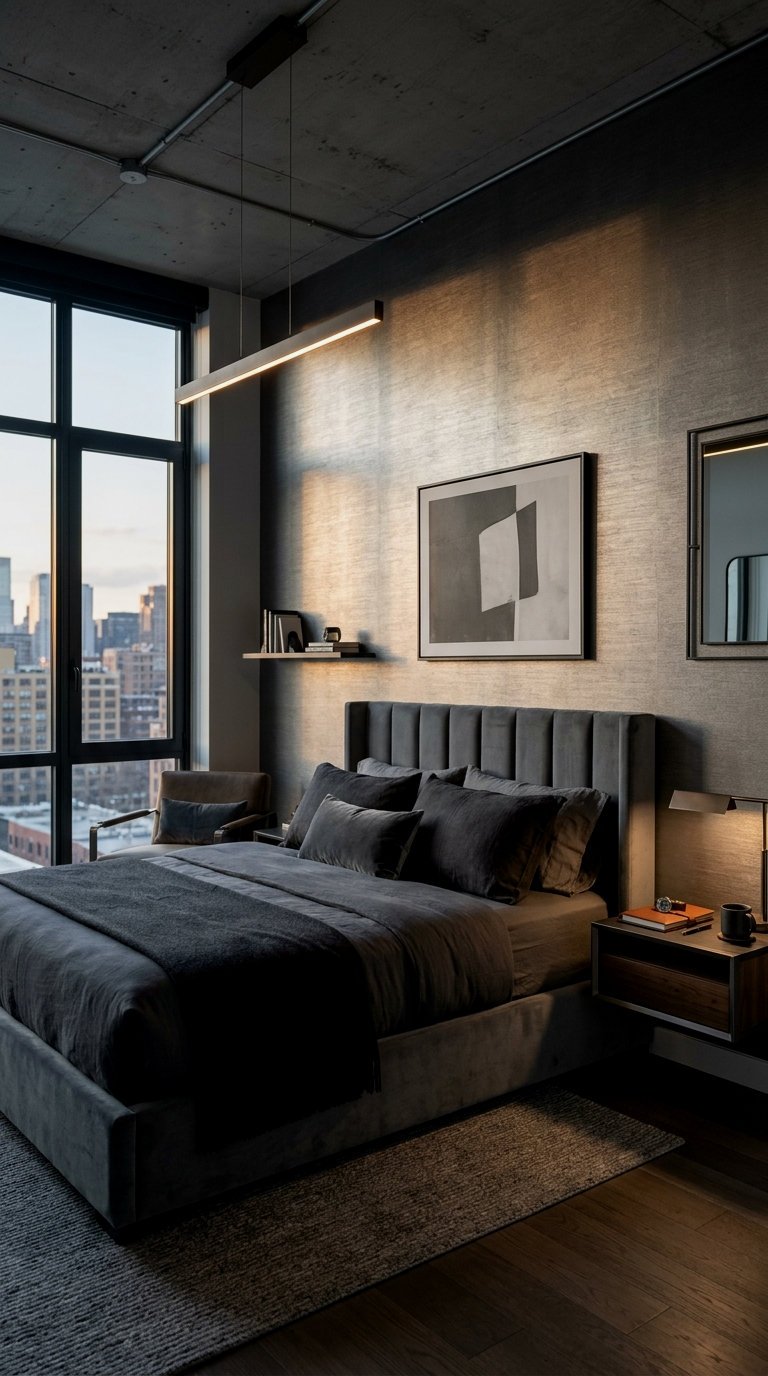
Obsessed is an understatement. This isn’t your grandma’s shiny silver foil; it’s a muted, brushed finish that looks like hand-applied metal leaf. It captures light in the most dramatic way, glowing softly rather than reflecting harshly. It’s perfect for a library or a small powder room where you want to lean into that industrial-chic aesthetic. Pair it with matte black accents to keep it from feeling “blingy.”
Midnight Navy Geometric Linework
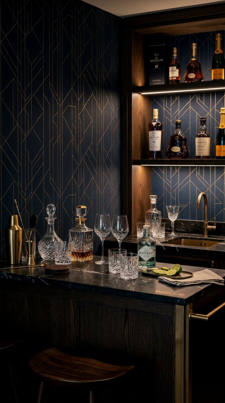
There is something so genuinely life-changing about a navy wall that isn’t just a solid color. A geometric linework pattern—think thin, metallic gold or silver lines on a deep navy base—adds a layer of “architectural intent.” It feels structured and smart. I love the options from West Elm or Graham & Brown for this. It’s the ultimate backdrop for a cognac leather sofa or a mid-century modern credenza in a dark walnut finish.
The 70/30 Moody Rule: In a room with dark wallpaper, 70% of your large furniture should be in a contrasting “middle” tone (like tan leather or warm wood) to prevent the space from feeling like a cave.
Smoked Oak Wood Slat Visuals
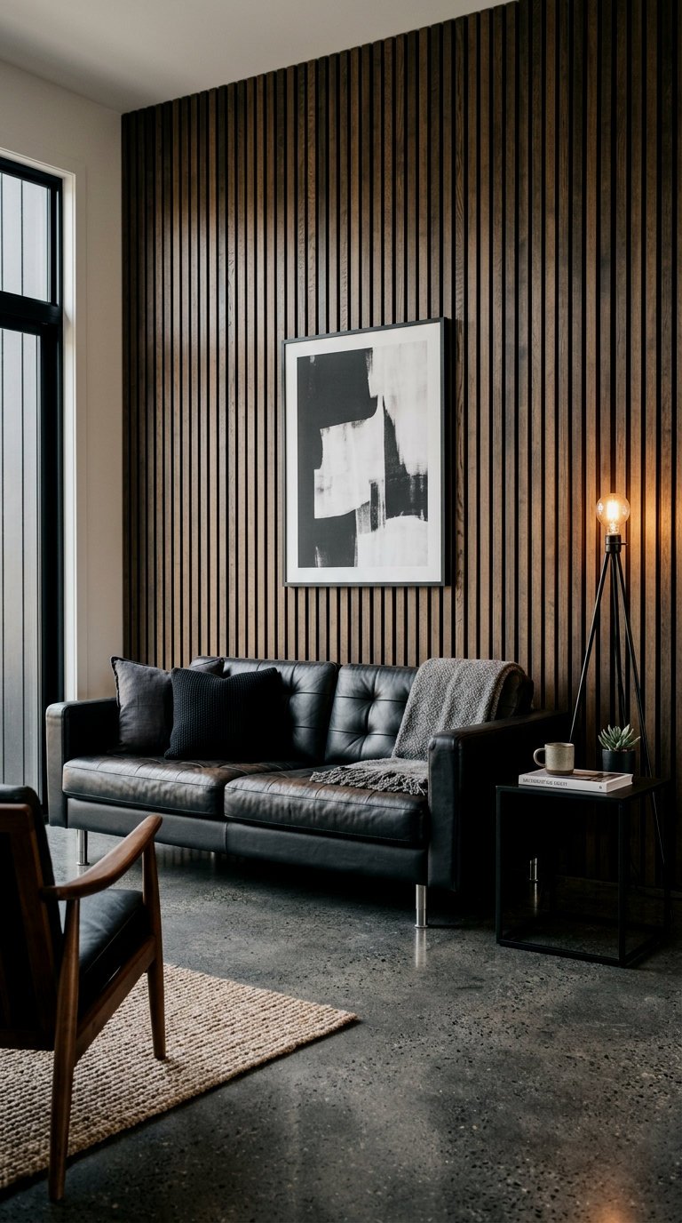
Trust me on this one: the “slat wall” trend isn’t going anywhere, but the price of real timber is wild. High-quality wood slat wallpaper (like the ones from Rebel Walls) gives you that architectural depth without the sawdust. It brings a linear, orderly masculine energy to a bedroom or a media room. The “smoked oak” finish is key here—it’s warmer than grey but cooler than traditional honey oak, making it feel current and high-end.
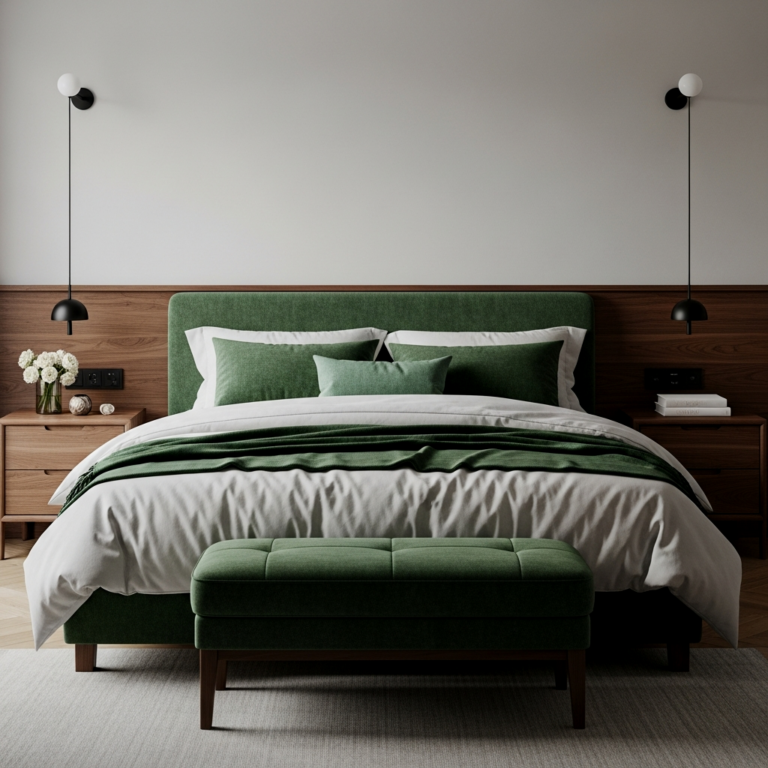
Install this on a single focal wall behind your bed and use matte black swing-arm sconces for a high-end bachelor pad vibe.
Dark Emerald Botanical Noir
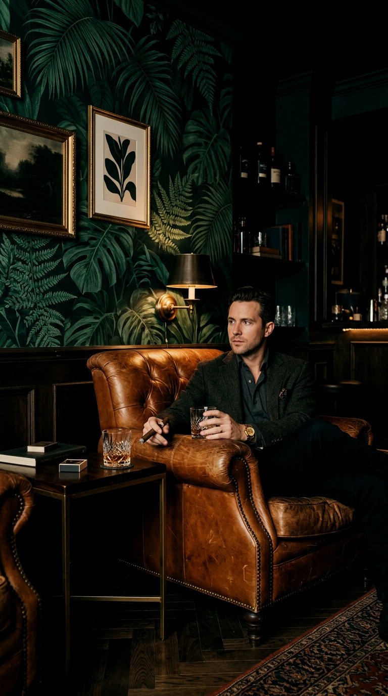
Botanicals aren’t just for cottage-core. When you take a large-scale leaf pattern and drench it in a moody emerald or forest green, it becomes incredibly masculine and “Old World.” It’s moody, it’s lush, and it feels like a private members’ club. Look for patterns with black backgrounds to really make that green pop. It’s a bold move, but the difference it makes in a dining room is unreal.
Raw Slate Stone Texture
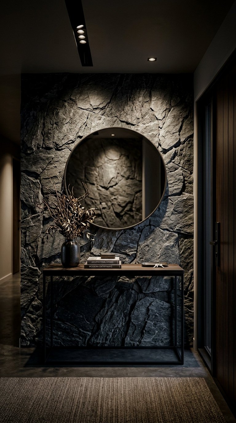
If you want a room to feel “unshakeable,” stone textures are the way to go. A slate-inspired wallpaper brings in those cool, blue-grey tones and a sense of ruggedness. It’s a fantastic way to add texture to a modern condo that might be lacking architectural character. I recommend looking for a “honed” or matte finish rather than something with a high gloss.
Matte Black Crocodile Leather
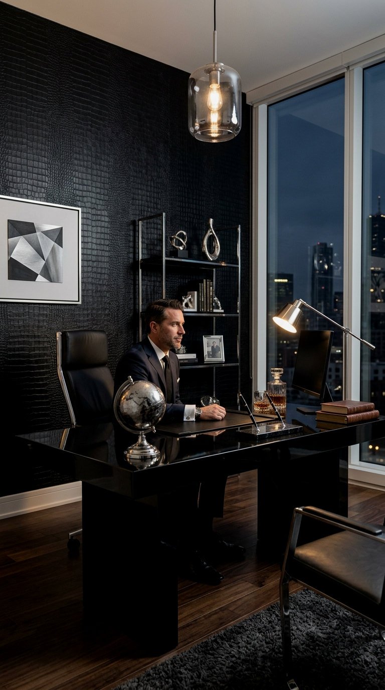
I know what you’re thinking—crocodile? But seriously, in a matte black finish, it’s the height of luxury. It’s about the subtle play of light on the “scales.” It’s incredibly tactile and adds a layer of “cool” that you just can’t get with paint. I’ve seen this used in small hallways or back-of-bookshelf linings, and it’s a total showstopper. Brands like Schumacher have incredible leather-effect papers that feel like the real deal.
The exact pieces that make these ideas work:
Oxidized Copper Patina
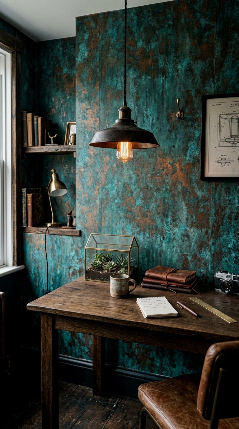
This is for the guy who loves a bit of an “edge.” An oxidized copper wallpaper features swirls of deep teal, rust, and verdigris. It looks like an art piece in itself. Because it’s so visually active, I love using this in a foyer. It sets a mood immediately: artistic, lived-in, and slightly rebellious. Pair it with a solid brass mirror to pull out those metallic undertones.
Don’t be afraid to mix your metals. The teal in the patina looks incredible with gunmetal grey or matte silver hardware.
Monochrome Abstract Smoke Swirls
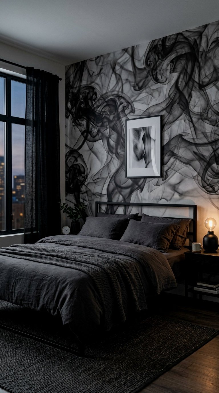
If you want movement without a “pattern,” abstract smoke or ink-wash wallpaper is your best friend. It’s very Rorschach-chic. In shades of charcoal, grey, and off-white, it feels like a giant piece of watercolor art. It’s a great way to soften a room that has a lot of hard angles and masculine furniture like heavy oak desks or steel shelving.
Deep Espresso Fluted Marble
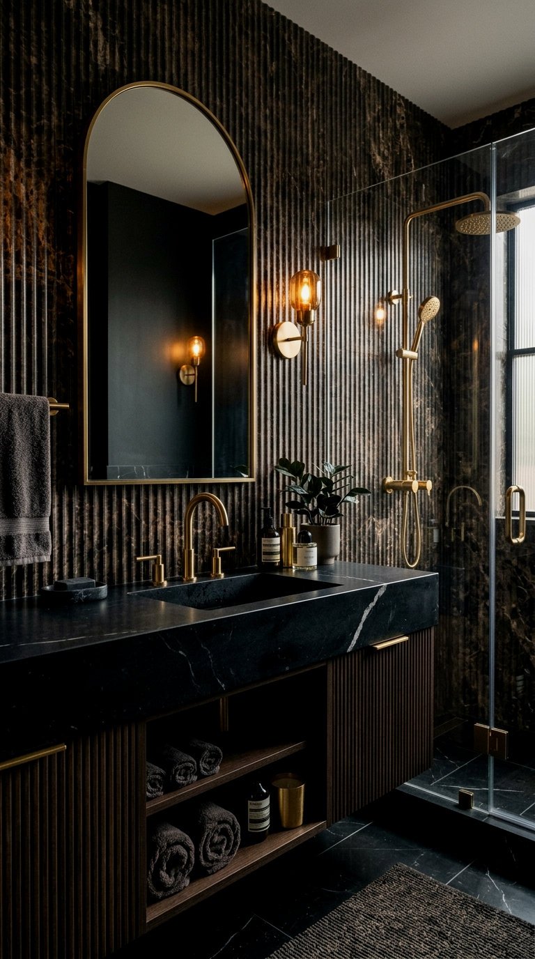
We’ve all seen white marble, but espresso marble? It’s a whole different level of sexy. When you combine that dark, veined stone look with a “fluted” or ribbed visual, you get a texture that feels incredibly bespoke. It’s a great way to make a fireplace wall or a bar area look like it was carved out of a single block of stone. I’m genuinely obsessed with how this looks under warm LED strip lighting.
Use a “paste-the-wall” version of this paper for a faster DIY. It’s way less messy and lets you reposition the ‘veins’ for a seamless look.
Antique Bronze Subdued Damask
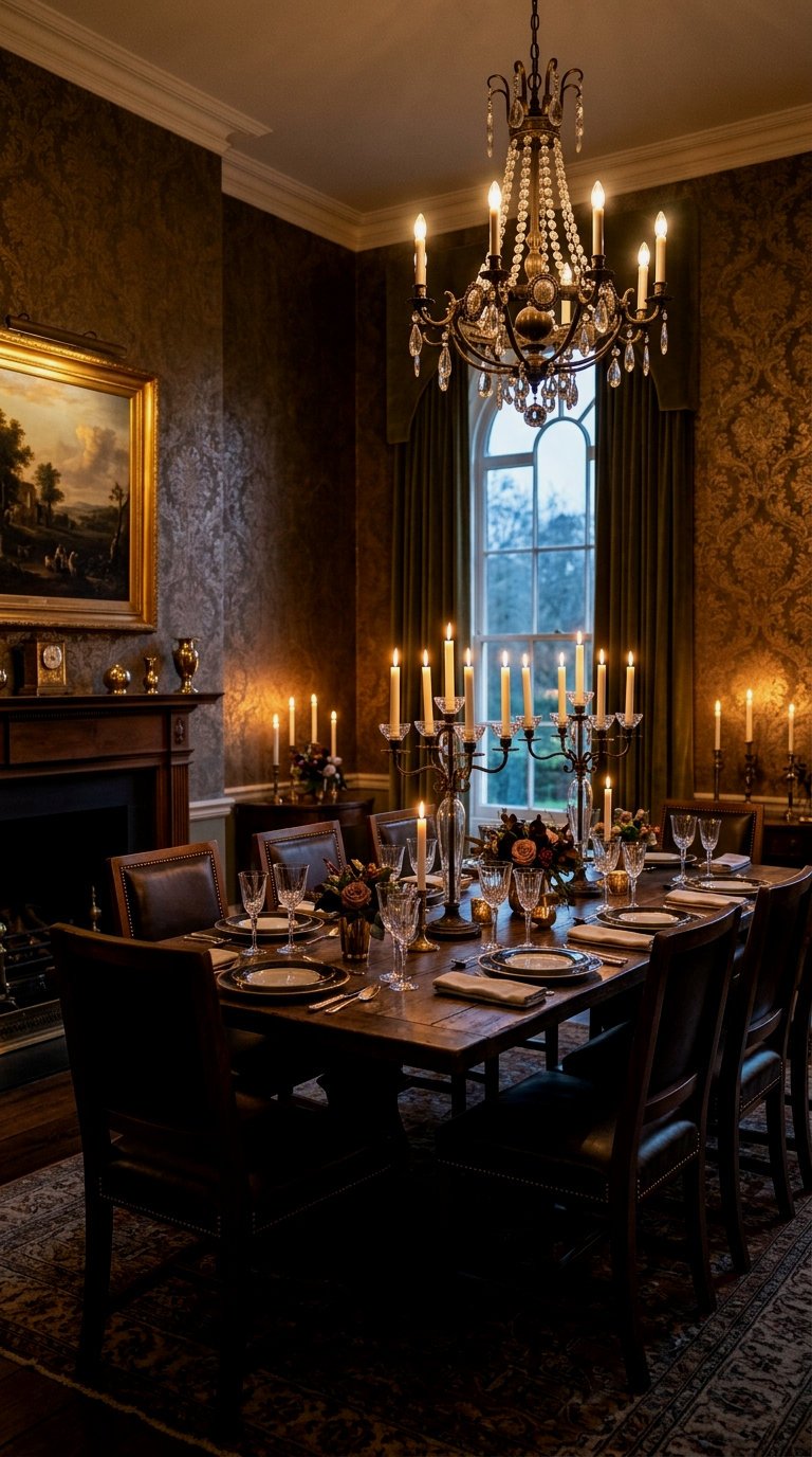
Forget the bright, shiny damasks of the 90s. The modern masculine take is all about “tonal” damask. Think a dark chocolate brown pattern on a slightly lighter bronze background. The pattern is only visible when the light hits it at a certain angle. It’s subtle, regal, and adds a layer of history to a space. It’s the kind of wallpaper that makes people want to reach out and touch the walls.
For a truly high-end finish, paint your baseboards, door frames, and crown molding the EXACT same color as the darkest tone in your wallpaper. This ‘color drenching’ effect makes the wallpaper feel integrated into the architecture rather than just ‘stuck on.’ I recommend Farrow & Ball ‘Railings’ for a soft, charcoal-black finish that goes with almost everything.
Concrete Brutalist Texture
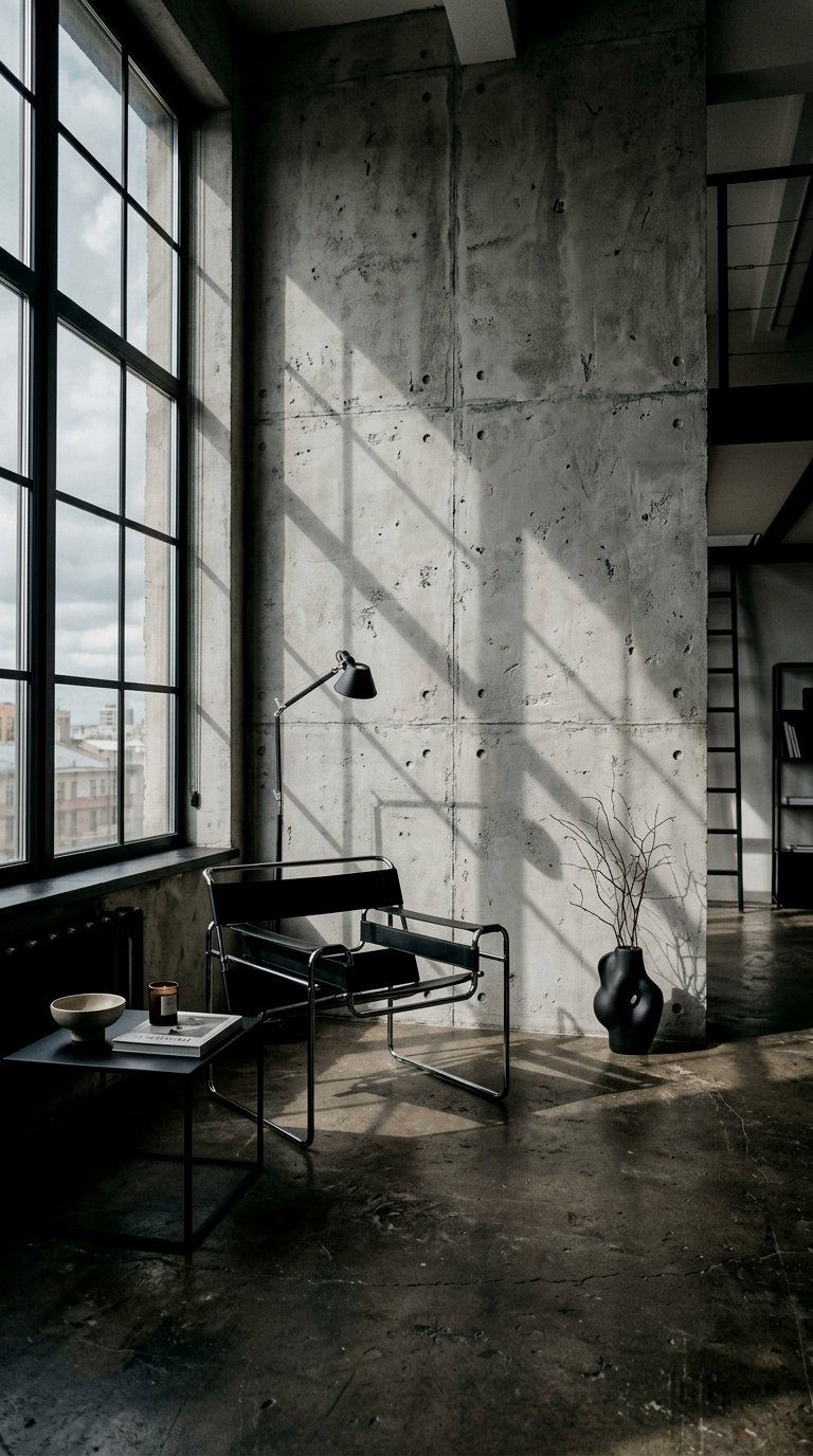
For the ultimate minimalist-masculine vibe, concrete-effect wallpaper is king. But don’t go for the cheap, flat prints. You want the ones with “pockmarks” and “seams” that look like poured concrete. It brings an urban, loft-like energy to any room. It’s the perfect backdrop for colorful abstract art or a bright “emergency orange” accent piece. It’s raw, it’s unapologetic, and it looks incredibly expensive when paired with high-quality materials like linen bedding or a wool rug.
To warm up concrete wallpaper, always introduce a natural wood element nearby—like a solid walnut side table or oak shelving—to balance the ‘cold’ industrial feel.
📏 12 Masculine Wallpaper Picks for a Moody, High-End Vibe (Trust Me, the Difference is Unreal) Quick-Win Checklist
- Order Samples First: Moody colors change drastically depending on your room’s natural light.
- Check Pattern Match: Geometric prints require more rolls because of the ‘waste’ when matching lines.
- Prep Your Surface: Dark wallpaper shows every bump. Use a ‘liner paper’ if your walls aren’t perfect.
- Consider the Trim: Decide if you’re going to paint your trim to match (highly recommended for a moody look).
- Light It Up: Plan for at least three sources of light (overhead, task, and accent) to show off the texture.
Switching up your walls is honestly the most impactful thing you can do for your home. It’s more than just decor; it’s about how the room makes you *feel* when you walk in at the end of a long day. Whether you go for the ruggedness of concrete or the quiet luxury of charcoal grasscloth, just remember that the “mood” is in the details. Don’t be afraid to go dark—I promise you won’t regret it. You’ve got this!
Frequently Asked Questions
Will dark wallpaper make my room look smaller?
It’s a common myth! While dark colors bring the walls “in,” they also add immense depth. If you use a wallpaper with a bit of texture or a subtle metallic sheen, it actually blurs the corners of the room, making it feel more expansive and intimate rather than small.
How do I choose the right scale for a masculine room?
Generally, larger patterns feel more modern and architectural, which aligns well with a masculine aesthetic. If you’re worried, choose a “tectonic” pattern like stone or wood visual where the scale is dictated by nature—it’s much harder to get wrong than a traditional floral or damask.
Can I use moody wallpaper in a room with no windows?
Yes, and honestly, you should! Powder rooms or basements with no natural light are the perfect places to lean into a moody vibe. Instead of fighting the darkness with white paint (which can look dingy), embrace it with a rich, textured wallpaper and layered artificial lighting.
Is peel-and-stick wallpaper okay for a high-end look?
Absolutely, as long as the print quality is high. Look for brands that offer a “linen” or “canvas” texture on their peel-and-stick options. The key to making it look high-end is a perfect installation—no bubbles and perfectly matched seams are non-negotiable.
What color furniture goes best with dark, moody walls?
Warm neutrals are your best friend. Think cognac leather, walnut or oak wood, and brass or bronze metals. If you want a pop of color, deep jewel tones like burnt orange, mustard yellow, or burgundy create a sophisticated, high-contrast look.