14 Small Girl Bedroom Color Ideas That Make the Walls Recede
I spent years trapped in the “safe white” prison when it came to decorating small spaces. Honestly, I thought any ounce of real color would make the walls close in and turn a cozy girl’s bedroom into a literal shoebox. I was so wrong, and quite frankly, a little bit annoyed that I wasted so much time staring at sterile, hospital-white walls. I wish someone had told me sooner that stark white can actually highlight the boundaries of a room, making it feel smaller, while the right hues can make those boundaries virtually disappear. When you’re looking for ways to maximize a tiny footprint, you need more than just furniture hacks; you need a color strategy that tricks the eye. If you’re currently tackling a cramped layout, pairing these color tips with 20 small girl bedroom ideas that actually feel huge is the secret sauce to a total transformation.
✨ Before You Start: 14 Small Girl Bedroom Color Ideas That Make the Walls Recede Mindset
Soft Sky Blue Ceiling-Drenching
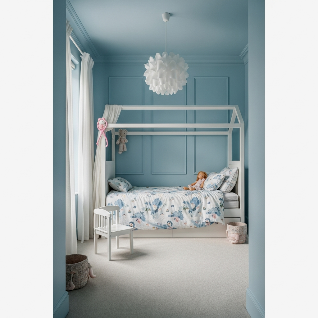
If you want to feel like the room has no ceiling at all, this is the one. By painting the walls and the ceiling the exact same shade of soft sky blue, you eliminate that harsh “lid” effect that happens with a white ceiling. It’s genuinely life-changing for rooms with low ceilings because your eyes just don’t know where the wall ends and the sky begins. No seriously, the room will feel like an open-air pavilion rather than a tiny bedroom.
Pale Lavender with Vertical White Stripes
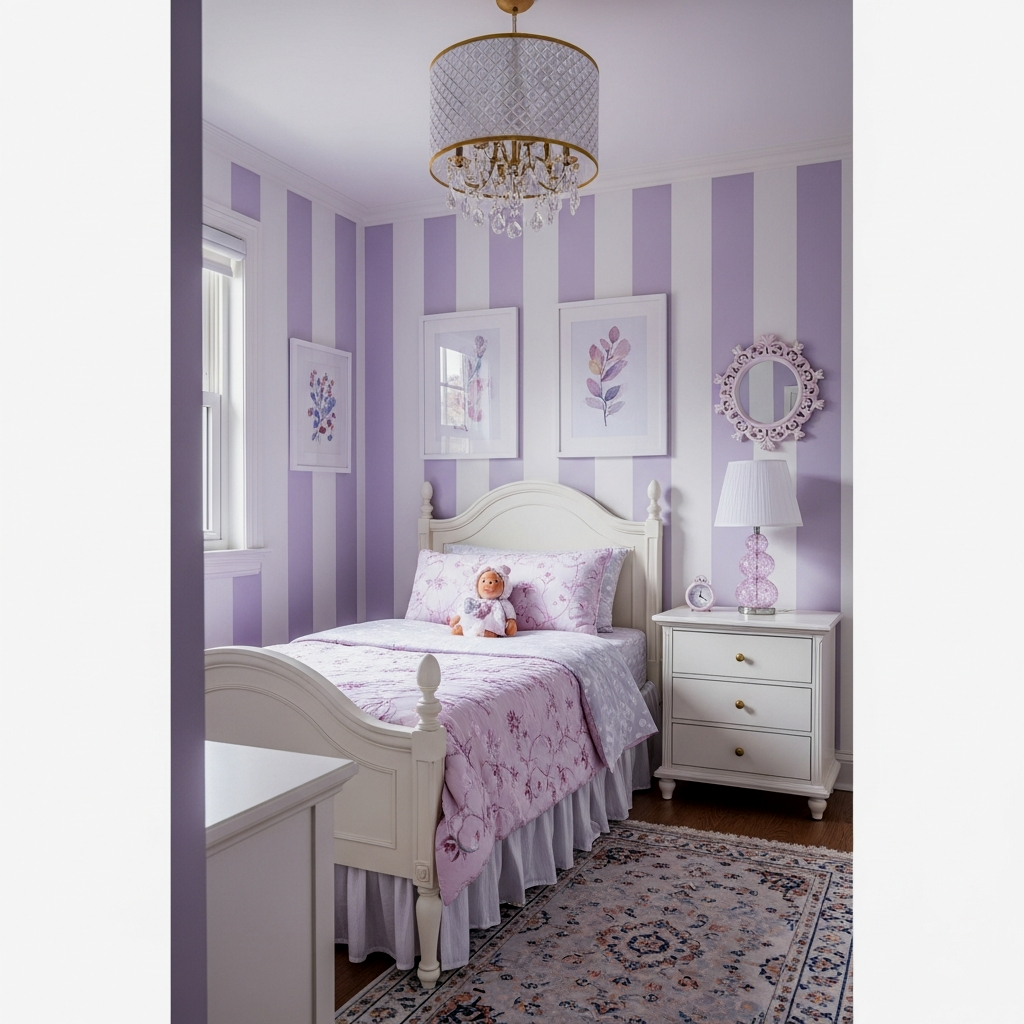
I am obsessed with how this looks in a young girl’s room. Vertical stripes are the oldest trick in the book for a reason—they draw the eye upward, making the ceiling feel a foot higher than it actually is. By using a pale lavender against a soft white, you get that height without the room feeling busy or overwhelming. The difference is unreal once those lines go up; it adds a sophisticated architectural element that screams “custom design.”
To keep stripes from feeling like a circus tent, make the stripes wide (about 10-12 inches) and use a matte finish for the lavender and a satin finish for the white to add subtle texture.
The Deep Navy Depth Illusion
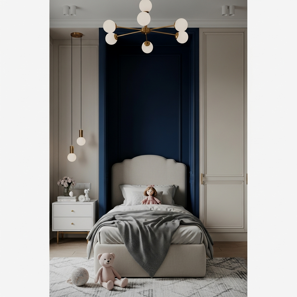
I know what you’re thinking: “Navy in a tiny room? Are you joking?” But trust me on this one. A deep, cool navy blue actually recedes from the eye. Because the color is so dark and absorbs light, the corners of the room seem to disappear into shadows, creating an illusion of infinite depth. It’s like looking into the night sky. You will not regret this if you pair it with light-colored bedding and metallic accents to keep things balanced.
Always match your window treatments to your wall color in a small room. This prevents the “choppy” look of a contrasting curtain, allowing the eye to glide across the walls without stopping, which makes the space feel significantly wider.
Monochrome Soft Sage Green
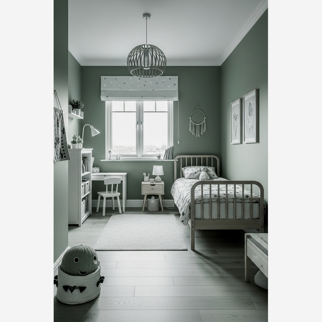
Sage green is having a massive moment, and for a small girl’s room, it’s a total breath of fresh air. Going monochrome—meaning you paint the trim, the doors, and the walls the same shade—creates a seamless flow. I cannot stress this enough: when the trim is painted a different color (like white), it creates a frame around every wall, highlighting exactly how small the room is. Erase the frames, and you erase the limits.
When going monochrome, use a semi-gloss on the trim and a flat or eggshell finish on the walls. It creates a tiny bit of “blink” that adds dimension without breaking the color flow.
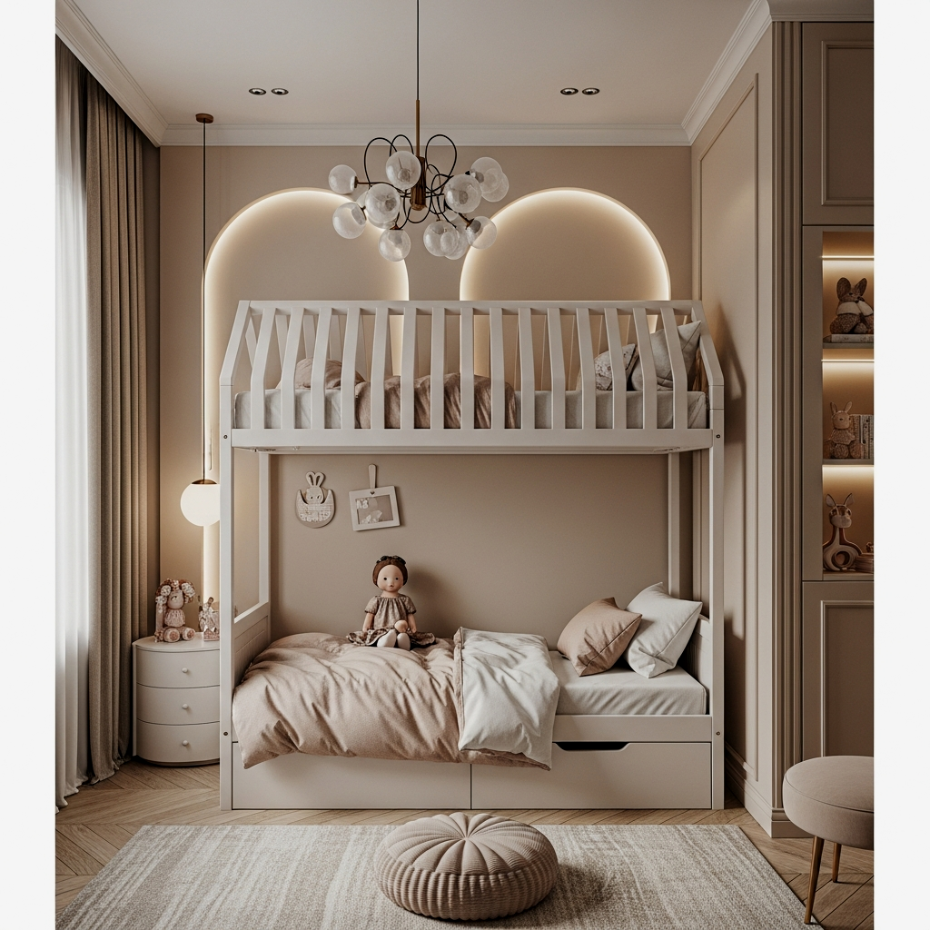
High-Gloss Warm Terracotta
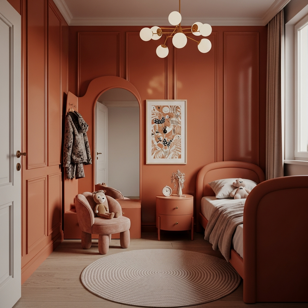
If the room is North-facing and feels a bit “cold,” a warm terracotta is the best kept secret for adding coziness without bulk. But here is the trick: use a high-gloss finish. The gloss acts as a mirror, bouncing light around the space and making the walls feel like they are shimmering and moving away from you. I was not prepared for how good this looks when the afternoon sun hits it.
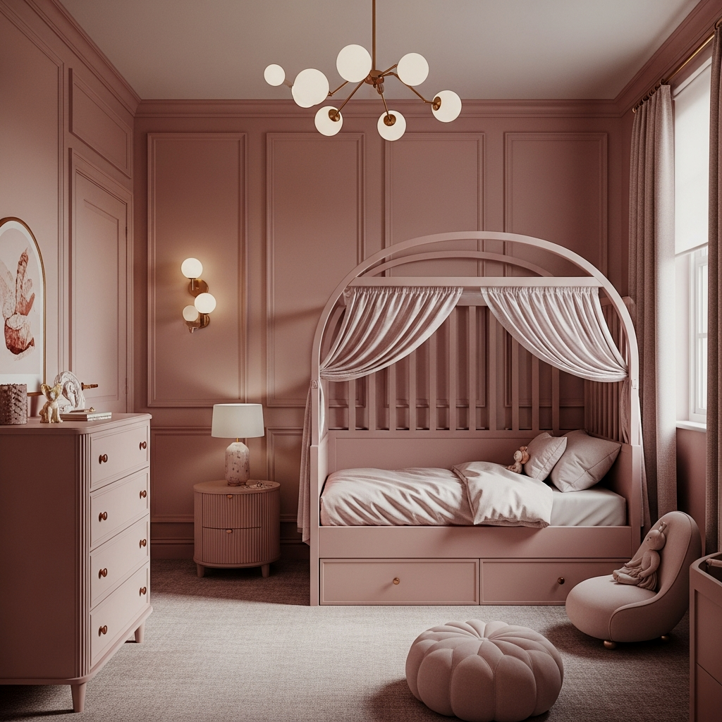
Dusty Blush Color-Drenching
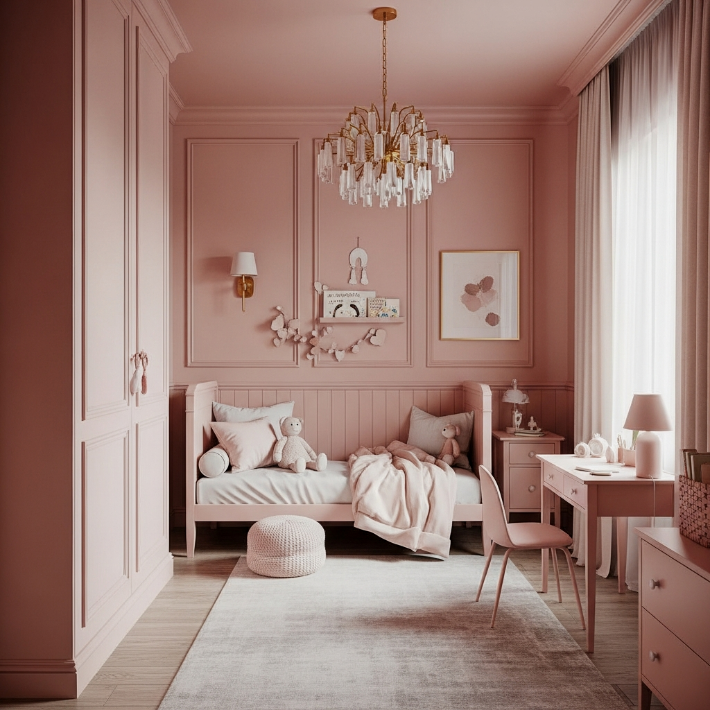
Forget the bubblegum pink of the past. A dusty, sophisticated blush used in a “color-drenching” style (walls, ceiling, and even the radiator!) makes the room feel like a soft, expansive cloud. It’s this alone is worth it for creating a serene environment that feels high-end and spacious. It’s pink, but grown-up, and because it’s a desaturated tone, it doesn’t shout at you.
Charcoal Focal Wall Receding
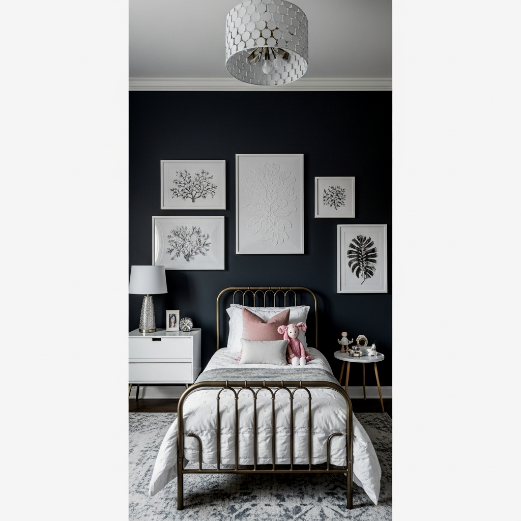
If you aren’t ready to go dark on all four walls, a charcoal focal wall behind the bed is this changed everything for me. Much like the navy, charcoal creates a sense of “ending” that isn’t really there. The wall pulls back, making the bed feel like it’s tucked into a deep alcove. Do not sleep on this if you have a long, narrow room that needs a bit of visual balance.
Keep the other three walls a very light, cool-toned grey rather than white. This keeps the contrast with the charcoal wall from being too jarring, which helps maintain the depth illusion.
The exact pieces that make these ideas work:
Muted Lilac Verticality
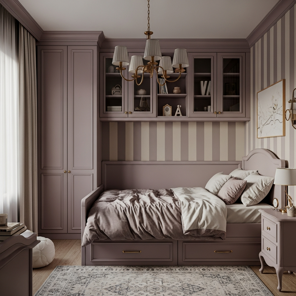
Similar to the stripes, but more subtle. Use a muted lilac on the walls and paint the vertical window casings and door frames a slightly darker shade of the same lilac. This draws the eyes up and down repeatedly, tricking the brain into thinking the vertical space is much more vast than it actually is. The results speak for themselves—it’s pure magic for a small girl’s room.
Icy Mint Expanding Tones
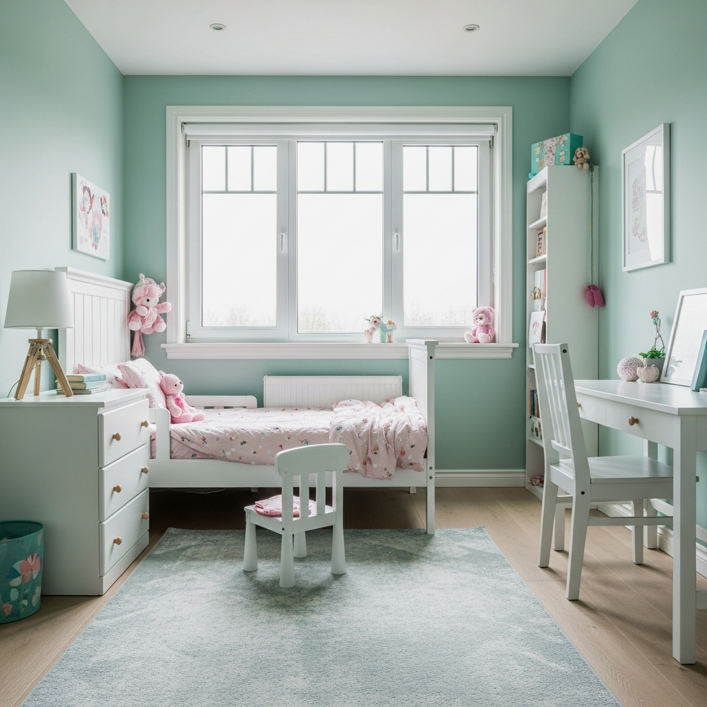
Mint is naturally a “receding” color because it’s so cool-toned. Cool colors (blues, greens, purples) visually move away from the viewer, while warm colors (reds, oranges) move toward them. Once you try this you cannot go back to beige. Icy mint feels crisp, clean, and incredibly expansive. It’s like the room is constantly taking a deep, refreshing breath.
Sandy Beige with Architectural Light
If you really want to stay in the neutral family, don’t do white. Go for a sandy beige with yellow undertones. The trick here is how it interacts with light. In a small room, this color makes the walls feel like they are glowing rather than just sitting there. It’s this is the one for a boho-themed room where you want to emphasize texture over bold color pops.
Deep Emerald Green Accent
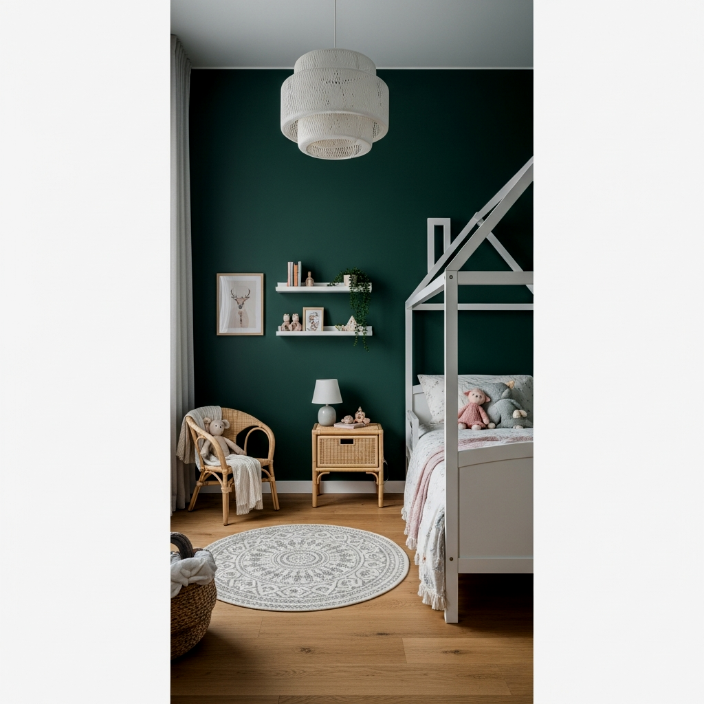
Emerald is so rich that it adds an incredible amount of dimension. If you have a small nook or a built-in desk area, paint it deep emerald green. It creates a “jewel box” effect that feels intentional and cozy rather than cramped. It’s genuinely life-changing how a tiny corner can become the most important-feeling part of the room just through color choice.
If you are painting a dark accent wall to add depth, make sure to paint the electrical outlets and switch plates the same color as the wall. Using white plastic covers on a dark wall creates “visual noise” that breaks the illusion of a receding wall. A $5 can of matching spray paint is your best friend here!
Peach-to-White Vertical Ombre
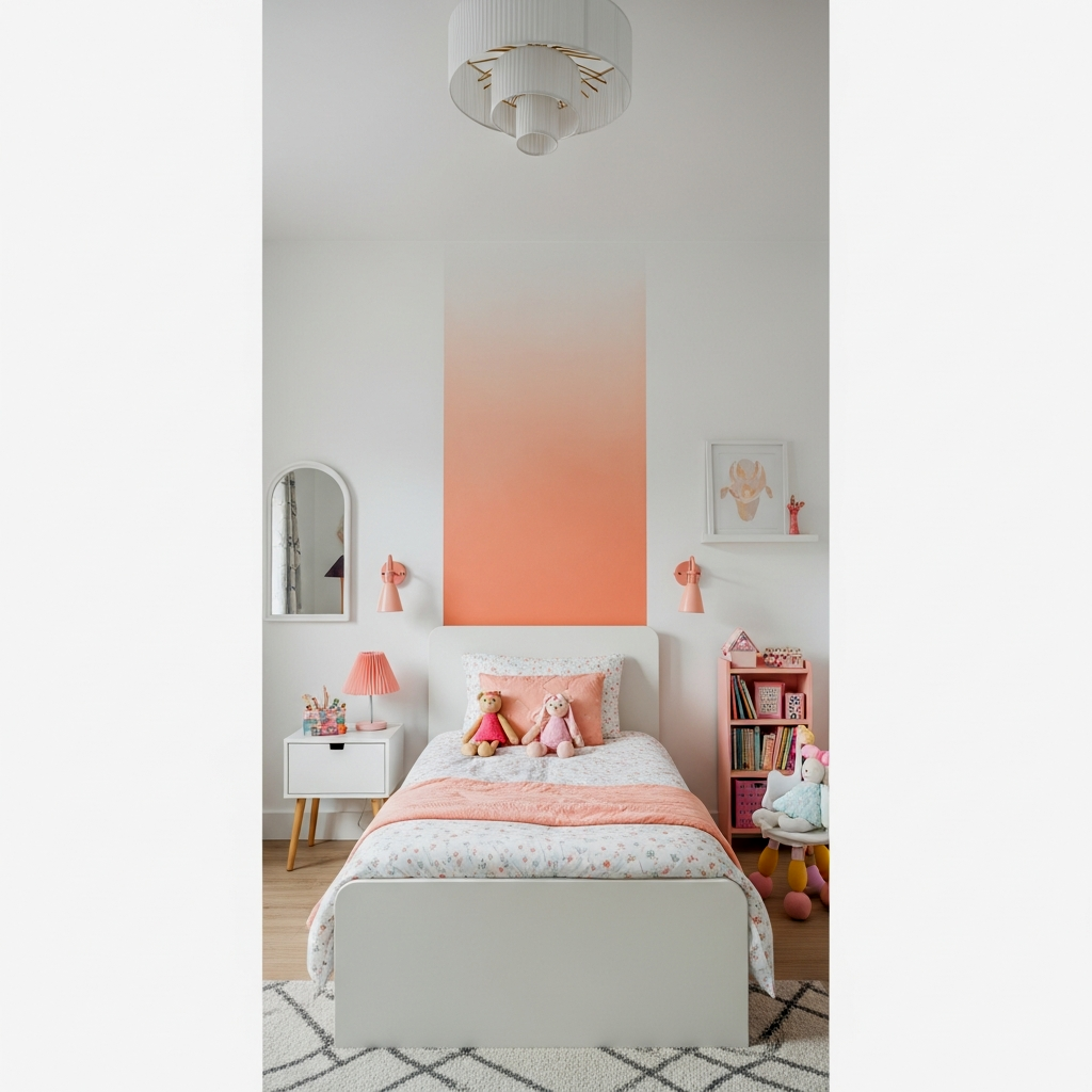
This is a bit more of a project, but trust me on this one, it’s stunning. Start with a warm peach at the floor and gradually blend it into a pure white toward the ceiling. This creates a vertical gradient that mimics the natural horizon. It makes the bottom of the room feel grounded and the top feel absolutely limitless. I was not prepared for how good this looks in a room with great natural light.
To get a perfect ombre blend, use a dry brush or a sponge to stipple the two colors together while they are still wet. Work in small sections to keep the paint workable.
Dusty Rose with Tonal Trim
Similar to sage, dusty rose works best when you keep the trim in the same color family. Instead of an exact match, try the trim just one shade darker. This provides just enough definition to look architectural without the stark “stopping point” of white trim. It’s the best kept secret for making a room feel expensive and curated while still pushing those walls back.
📏 14 Small Girl Bedroom Color Ideas That Make the Walls Recede Quick-Win Checklist
- Ditch the White Ceiling: Use a wall-matching color to eliminate the “lid” effect.
- Go Vertical: Use stripes or gradients to lead the eye upward.
- Cool Tones First: Prioritize blues, greens, and purples for maximum recession.
- Paint the Trim: Match trim to walls to prevent visual breaks.
- Finish Matters: Use gloss to bounce light or matte to hide boundaries.
Pearl Grey Tone-on-Tone
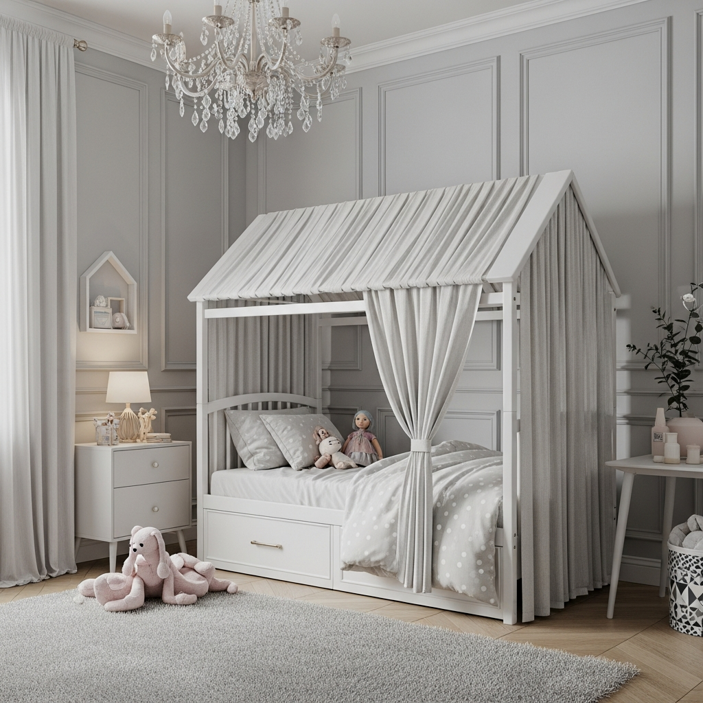
Pearl grey is the ultimate “phantom” color. It’s just enough color to feel sophisticated, but light enough to bounce every bit of available sun. By using tone-on-tone (different shades of the same grey for walls, bedding, and rugs), the edges of the room become incredibly soft. Once you try this you cannot go back to basic neutrals. It’s the ultimate way to make a tiny space feel like a grand suite.
Add a large mirror on the wall opposite the window. The pearl grey walls will reflect in the mirror, doubling the perceived depth of the room instantly.
Painting a small room doesn’t have to be a source of anxiety. Once you realize that color is a tool for manipulation rather than just a decoration, the possibilities are endless. I truly hope these ideas give you the confidence to pick up that paintbrush and try something bolder than basic white. If you’re ready to dive even deeper into furniture layout and storage hacks to go along with your new color, definitely check out my full guide on 20 small girl bedroom ideas that actually feel huge. You’ve got this!
FAQ
Can dark colors really make a small room look bigger?
Yes! Dark, cool-toned colors like navy or charcoal absorb light and “recede” from the eye, making corners disappear and creating an illusion of depth that white often can’t achieve.
What is color-drenching?
Color-drenching is the practice of painting everything in a room—walls, ceiling, trim, doors, and even radiators—the same color. This eliminates visual breaks and makes the space feel more expansive.
Why do vertical stripes help in a small bedroom?
Vertical stripes draw the eye upward toward the ceiling, which tricks the brain into perceiving more height. This is especially helpful in small rooms with standard or low ceilings.
Should I use a matte or gloss finish in a small room?
Both work for different reasons! Matte hides imperfections and makes walls feel soft and distant, while high-gloss bounces light around the room like a mirror, which can make the space feel brighter and more open.
Is white paint ever a mistake for a small room?
It’s not a “mistake,” but it’s often a missed opportunity. In rooms with little natural light, white can often look dingy and grey, whereas a deliberate color choice can add character and a sense of purposeful depth.